GoodUI – a running list of practical ideas to try out
Tag: web design
Infinite Scrolling: Let’s Get To The Bottom Of This
This Is Responsive.
WordPress plugin : DW Shortcodes Bootstrap
GitHub : new look
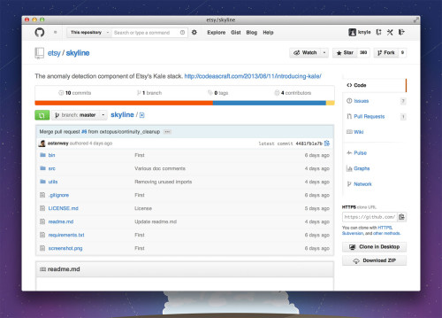
GitHub blog announced a new look and navigation for the programmers’ best friend. Have a look at some of the screenshots, say “WOW!” and rush back to your repositories, looking for the magic “Enable Repository Next” button.
This being a big change and GitHub being such a crucial daily tool for so many people, the changes will be rolled out slowly. So you might need a bit of luck or time to see it right now. Gladly, my repositories do have the feature, and once switched to, they do look better. Navigation is simpler indeed, but will need a little getting used to, as I have it in the muscle memory by now. I also like a tiny bit of more color added, as the white and lightly not white were slightly disorienting after long coding and merging hours.
To the GitHub team: thank you guys, you are awesome! Please keep doing what you are doing – it’s obviously working.
