WordPress 2.9 media features poll

Check out this poll for media-related features for the upcoming WordPress 2.9.  This is your chance to influence the priorities.  Features on the menu are:

  • Additional Media Filters, which would help you pick media that was used recently, or more often, or is your favourite, etc.  I don’t find it very important for my usage scenarios, because I rarely re-use media files in other posts.
  • Basic Image Editing, which will allow things like crop, rotate, and resize.  Even though I can use standalone image editors, I know of quite a few non-technical people who would appreciate basic image controls.
  • Better Media Settings, which will provide more defaults and more options to change for each upload.  I have enough options for my media usage already, so I don’t find this to be of high importance.
  • Bulk Media Import API, which will be appreciated by web development companies and such.  Anything that helps automation and bulk processing is A Good Thing.  Also, with more attention to media functionality in WordPress, I suspect some people would prefer to host their own images and videos, rather than to use third-party services (YouTube, Flickr, and such).  Moving all that content into WordPress with API is a dream come true.
  • Custom Image Sizes, which will allow for more and truly customized image sizes.  While I can understand the importance of this for some people, I suspect that most are satisfied with what is there now.   Plus there is a range of plugins, and workarounds available that make this problem of less importance.
  • Easier Embeds, for content coming from third-party services like Flickr, YouTube, and such.  This is something I’d really love to see done.  Currently, there are plugins to cover most cases, but I believe a built-in way is in order.  Plus plugins often miss important parts of the site, such as feeds.  And plugins rarely work well with other plugins.  If this functionality is in the core, or in a plugin, which is a part of main download, extending and re-using such functionality would be easier.
  • Media albums, as in standalone galleries, rather than media galleries attached to a post.  That’s something that a lot of people would find useful.  For example, bringing all YouTube videos from all your posts into a single gallery would be awesome.
  • Media metadata, which is adding categories and tags to media files.  Well, while it sounds cool, I think it will add more confusion to people.  With such functionality, WordPress will become more of a generic content management system.  For example, together with media albums, you’d be able to use WordPress as a pure image gallery application.
  • Post thumbnails, which would associate an image with your post.  I think this functionality is only useful to a small bunch of people, and it is currently available via plugins.  I don’t think it’s worth putting it in the core.
  • Revised Media User Interface, which would improve the experience in the media editor.  I don’t know how many people find it difficult to use actually, because it works like a charm for me, and I find it easy to explain to non-technical users as well.  But if there are ideas on how it could be much improved, then why not.

If you have any opinions on the above, please vote in the poll first, and then share them in the comments second.
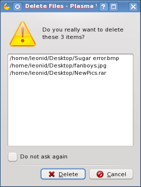
Delete files dialogue in KDE = ugly

As I am getting used to KDE 4 more and more, I am enjoying it more and more.  It delivers plenty of visual pleasure while being quite fast and user friendly.  However, there this one tiny little thing which annoyed the heck out of me since ancient times.   It’s the delete files confirmation dialogue.  Every time I select one or more files to delete, here is what I get.

KDE delete files dialogue

The more files I have to delete and the longer their paths, the uglier it looks.  And you know what annoys me the most?  It’s that fixing this ugliness is pretty simple.  Just collapse and hide the list of files which are about to be deleted, and give a “Details…” button or link to expand the list for those who really care or want to double check.  This way, the popup will be much smaller, providing enough of necessary information (“delete” vs. “move to Trash”, and “3 items” vs. “all these items”).

I don’t know how this managed to stay in for so long.  Am I the only one who cares about this?  Or are there so few KDE developers that nobody has the time to fix this?  Do I really need to this myself?  I hope not …

Firefox extensions

Yesterday was a somewhat slow day, so I spent some time on the housekeeping of my Firefox browser.  Somehow I managed to accumulate a lot of extensions, themes, plugins, bookmarks, bookmarklets, and what not.  It felt like a good time to clean the mess up a bit.

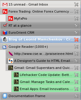
I spent about two hours going through the list of all installed pieces, upgrading outdated versions, changing old solutions to the modern alternatives, getting new tools, and so on.   I have to say that after that effort my Firefox works faster, and it suits me better now.  One of the biggest changes from my previous setup became the use of Tab Kit extension.  Among its many features, it has the one that I’ve been passively looking for for a long time now – tab bar on the right side, instead of top, but not as a part of the sidebar, and with a tree view.  Combined with Aging Tabs extension, the result is exactly the way I wanted it.

(it is better in real life than it is on the screenshot)

Now when I open links from the site in the new tabs, these new tabs are organized in a tree like structure.  Tabs that I haven’t yet visited are highlighted in green.  Current tab is highlighted in blue, as usual.  And the rest of the tabs are coloured in different shades of grey, depending on how long ago I last viewed them.  Also, because the tab bar is separate from the sidebar, I can get an additional panel on demand, with an application that I need the most at the moment, without sacrificing my precious tabs.

And just in case you are wondering which other extensions I am using, continue reading for the list of all extensions, which was generated by one of the extensions on that list.

Continue reading Firefox extensions

Annoying software

Slashdot is running the post about annoying software.  The fact that Slashdot crowd mostly consists of computer geeks is sort of a guarantee for some interesting comments.

With my Fedora 9 saga I had to review and try a lot of new software.  Needless to say, I found quite a few annoying bits.  Here is a brief list, just to give you an idea:

  • Clock applet in Gnome. It shows calendar with Sunday being first day of the week.  If you don’t like it, you’ll have to recompile your locale to change it. This one is cancelled out though by an excellent support of Google Calendar (or, for that matter, any other web published calendar).
  • Metacity window manager in Gnome. Window titles are displayed in the middle.  This is really annoying for those of us who are used to seeing them on the left.  There is no option to change this setting either in GUI or in GConf.
  • Pidgin new message notification. I once had it popping up nice looking bubbles, but I don’t remember how I managed to do it.  I also don’t remember how I managed to break it.  And I have no idea to bring them back.  I really miss them though.
  • WordPress 2.5 post editing screen. It has been much reworked in the latest version and looks and feels so much better. However, the list of categories was moved from a really convenient location on the right of the screen to a really inconvenient location at the bottom of the screen.
  • FileZilla FTP manager. This one drives me nuts with server connections.  It either disconnects every 40 seconds when being idle.  Or it keeps multiple connections open forever and most FTP servers block me out temporary.
  • Request Tracker (RT3). Works perfectly with queues and tickets, but annoys the heck out of me when I need to do something with users.  Users aren’t first level citizens, like tickets.
  • SugarCRM. Excellent business tool, with lots of small annoyances, like not being able to set default user role, disable theme selector everywhere, change logos to company ones, lock down the functionality, etc.  Most of these are easily fixable.  But some aren’t as trivial as they may sound or seem.
  • Google Reader. This one annoys me a bit (but often) when I want to leave a few items in the feed unread and go deeper into archives.  Somehow it keeps marking everything I passed as read.

Now, what piece of software were you annoyed with recently?

Googley Design Principles

Very much in line with the image explaining simplicity of user interfaces, comes the list of Googley Design Principles:

1. Focus on people—their lives, their work, their dreams.
2. Every millisecond counts.
3. Simplicity is powerful.
4. Engage beginners and attract experts.
5. Dare to innovate.
6. Design for the world.
7. Plan for today’s and tomorrow’s business.
8. Delight the eye without distracting the mind.
9. Be worthy of people’s trust.
10. Add a human touch.

Anyone doing any sort of user interface work should learn these by heard and repeat them as every morning mantra.