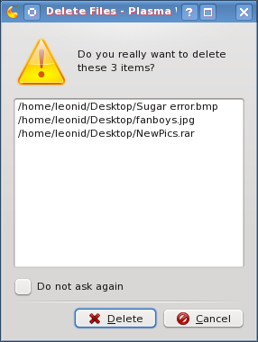
As I am getting used to KDE 4 more and more, I am enjoying it more and more. It delivers plenty of visual pleasure while being quite fast and user friendly. However, there this one tiny little thing which annoyed the heck out of me since ancient times. It’s the delete files confirmation dialogue. Every time I select one or more files to delete, here is what I get.

The more files I have to delete and the longer their paths, the uglier it looks. And you know what annoys me the most? It’s that fixing this ugliness is pretty simple. Just collapse and hide the list of files which are about to be deleted, and give a “Details…” button or link to expand the list for those who really care or want to double check. This way, the popup will be much smaller, providing enough of necessary information (“delete” vs. “move to Trash”, and “3 items” vs. “all these items”).
I don’t know how this managed to stay in for so long. Am I the only one who cares about this? Or are there so few KDE developers that nobody has the time to fix this? Do I really need to this myself? I hope not …