Flickr on black

Being a huge fan of Flickr, I am always trying to bring more people to the service.  Because more people = more images and more comments, which, of course, means more fun and inspiration.

One of the most frequent reasons NOT to use Flickr that I’ve heard coming mostly from amateur and professional photographers was that Flickr is only available with white background and only with up to medium-sized images.  That is true.  While Flick is constantly improving their service, some features are still not there.  And maybe they are not coming any time soon.  But.  That doesn’t mean that there is no work around.  After all, the world of technology is blessed with plenty of excellent open source software these days.  So, here is how you can solve the problem of size and color, if you are one of those people who prefers it the other way around.

  1. Get yourself a copy of an real web browser – Firefox.
  2. Install Greasemonkey extension for Firefox.
  3. Install Flickr On Black user script for Greasemonkey.

Once you’ve done the above steps, go to Flickr and find a picture that you want to enjoy on black or in a different color.  On the image page, scroll down to the part where you can see “Additional information” on the right side.  Among them, you’ll see a few new links.  “View on black: Regular, Large” will be among them.
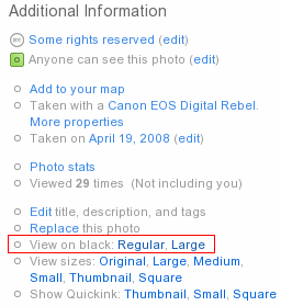
Click, and you are done.  The link will take you to another page, which will look something like this.  You can switch between Regular and Large size, as well as between black and white backgrounds right on that page.

P.S.: While you are getting Flickr on Black user script for Greasemonkey, look around.  There are thousands of other scripts to customize anything and everthing from Google search results and GMail to IMDB movie information and Twitter messeging.

P.P.S.: Alternatively, you can take a look at Flickr “Lights Out” or “Flickr in mostly black and orange” user scripts for Greasemonkey.

P.P.P.S: Many Greasemonkey scripts work perfectly in browsers other than Firefox – Opera, Safari, etc.  But I’d still recommend to use Firefox.

Firefox extensions

Yesterday was a somewhat slow day, so I spent some time on the housekeeping of my Firefox browser.  Somehow I managed to accumulate a lot of extensions, themes, plugins, bookmarks, bookmarklets, and what not.  It felt like a good time to clean the mess up a bit.

I spent about two hours going through the list of all installed pieces, upgrading outdated versions, changing old solutions to the modern alternatives, getting new tools, and so on.   I have to say that after that effort my Firefox works faster, and it suits me better now.  One of the biggest changes from my previous setup became the use of Tab Kit extension.  Among its many features, it has the one that I’ve been passively looking for for a long time now – tab bar on the right side, instead of top, but not as a part of the sidebar, and with a tree view.  Combined with Aging Tabs extension, the result is exactly the way I wanted it.

(it is better in real life than it is on the screenshot)

Now when I open links from the site in the new tabs, these new tabs are organized in a tree like structure.  Tabs that I haven’t yet visited are highlighted in green.  Current tab is highlighted in blue, as usual.  And the rest of the tabs are coloured in different shades of grey, depending on how long ago I last viewed them.  Also, because the tab bar is separate from the sidebar, I can get an additional panel on demand, with an application that I need the most at the moment, without sacrificing my precious tabs.

And just in case you are wondering which other extensions I am using, continue reading for the list of all extensions, which was generated by one of the extensions on that list.

Continue reading Firefox extensions

The state of browser affairs

First, a little joke to set the scene (forgive a rough translation from Russian)…

Lion, the king of all animals, was running some statistics over his animal kingdom.  He called all animals and made the speech.  “Dear all,” – he said, – “I am trying to figure out how to direct the educational program in the upcoming year.  For that I need some stats.  Those of you who are strong, please stand on my right.  Those of you who are smart, please stand on my left.  And let me count you…”

Strong animals – elephants, bulls, hippos, etc – all moved by the lion’s right paw.  The smart animals – beavers, rats, foxes, etc – grouped by lion’s left side.  When the dust settled, there was a one animal still running around blubbering something.  All attention turned towards the creature, and everyone saw the monkey.  It was running back and forward from one group to another and back again, thinking out oud: “strong to the right, smart to the left.. .strong to the right, smart to the left… and me? what about me?  Do I have to cut myself in half or what?” …

For the last few days, I feel a little bit like that monkey.  The thing is that I’m using two browsers right now, I can’t continue using two browsers, and I can’t pick one.  Those of you following me on Twitter might be somewhat aware of the situation.

I love Firefox.  I’ve been using it for years, and I don’t see it going anywhere.  It has plenty of functionality (especially through plugins and extensions) that no other browser has.  It does whatever I want it to do and then a little bit more.  But it’s so slow that I can’t stand it.  I have removed all extensions that I don’t use.  I have disabled all extensions that I use from time to time.  I read all optimizations tips on the web and tried a few thoughts of my own.  It helped, but not enough.  Nothing has solved the problem.  Scrolling is still slow.  Especially with a few tabs open.  Switching between tabs is slow. Opening a new tab is slow.  And these are things I do a few thousand times a day.  Even milliseconds count for this operations.  Firefox allows itself to spend almost full seconds.

On the other hand, I have Opera – a fantastically fast browser.  It even has a lot of features that make browsing the web so pleasant. Tabs, search bar, downloads management, history and bookmarks, fast dial, notes, and many more.  But.  Those aren’t enough.  Even with recently introduced widgets it still doesn’t cover the functionality that I need.  By far.  Not even 50%.  But it’s so fast that it almost makes me not care.  Almost.

Opera has practically no integration with social services – something that I work a lot with.  No comparison can be made with Firefox extensions for Twitter, Flickr, and del.icio.us here.  It has practically no integration with other, less social, online tools – specifically the Google pack of services (Gmail, Calendar, Reader, etc).  And it misses the most important area of my work – web development.  Source code formatting, highlighting, editing, analysis, testing, troubleshooting…

I am confident that the situation will improve and resolve itself pretty soon.  Firefox is getting a lot of momentum and already plenty of optimizations went into upcoming Firefox 3.  Opera is getting a lot of hype and user base on mobile devices.  People are starting to develop for it.

But I can’t wait…

Upgraded to WordPress 2.0.2

Ok, guys.  I’ve been planning to do this for about three month now. WordPress 2.0.2 is way too sweet (I know this from using it for my other projects) for me to use 1.5.2, so here it goes.

I’ve upgraded this blog.  It was easier than I expected (I tried it on another, simplier installation o’mine).  The secret was in the cleanup of unused plugins.  Since I’ve tried a bunch of things, there were cluttering up in my plugins/ directory.  As soon as I removed all unused ones, I had only a few plugins to check for compatibility.

Sadly, not everything works after the upgrade.  One of the plugins that I heavily rely on – phpexec – doesnt’ work.  I’ll fix it ASAP, but for now it means that archives and blogroll are out of reach.

If you’ll notice any other strange behavior, please let me know.

P.S.: The WYSIWYG editor and AJAX admin interface are so shweeet…

SPAM protection review

It’s been less than a month since I installed SPAM Karma 2. It didn’t take me long to see the benefits. Just four days later I wrote this post.

Today, looking through the plugin statistics, I thought – “Why don’t I post them?”. So, here they are:

  1. Total Spam Caught: 1002 (average karma: -102.87)
  2. Total Comments Approved: 141 (average karma: 14.74)
  3. Total Comments Moderated: 13
  4. Current Version: 2.2 final r2

So, in less than a month SPAM Karma 2 saved me more than a thousand contacts with SPAM. At the same time, it stood out of the way almost 150 times when legitimate comments were posted. And only 13 times it didn’t know what to do and left comments for me to moderate. Pretty good numbers, I have to say.

False positives? None of the legitimate comments were marked as SPAM. About 20 SPAM comments got through and I had to marked deal with them manually. The shiny 2.2 update came out a couple of days ago to deal with the new wave of “smart” spambots.

As for me, I am very very very satisfied with the results. I just hope that this plugin will continue to work the way it does now. I’m willing to install upgrades.

Thank you all who participated in this work!