Awaiting….

Open source software activity usually bumps up quite a lot before and during Christmas.  This time around I am waiting for:

What are your waiting for this year?

Flickr on black

Being a huge fan of Flickr, I am always trying to bring more people to the service.  Because more people = more images and more comments, which, of course, means more fun and inspiration.

One of the most frequent reasons NOT to use Flickr that I’ve heard coming mostly from amateur and professional photographers was that Flickr is only available with white background and only with up to medium-sized images.  That is true.  While Flick is constantly improving their service, some features are still not there.  And maybe they are not coming any time soon.  But.  That doesn’t mean that there is no work around.  After all, the world of technology is blessed with plenty of excellent open source software these days.  So, here is how you can solve the problem of size and color, if you are one of those people who prefers it the other way around.

  1. Get yourself a copy of an real web browser – Firefox.
  2. Install Greasemonkey extension for Firefox.
  3. Install Flickr On Black user script for Greasemonkey.

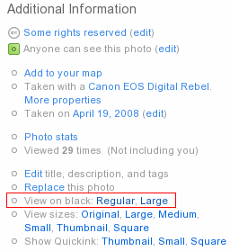
Once you’ve done the above steps, go to Flickr and find a picture that you want to enjoy on black or in a different color.  On the image page, scroll down to the part where you can see “Additional information” on the right side.  Among them, you’ll see a few new links.  “View on black: Regular, Large” will be among them.

Click, and you are done.  The link will take you to another page, which will look something like this.  You can switch between Regular and Large size, as well as between black and white backgrounds right on that page.

P.S.: While you are getting Flickr on Black user script for Greasemonkey, look around.  There are thousands of other scripts to customize anything and everthing from Google search results and GMail to IMDB movie information and Twitter messeging.

P.P.S.: Alternatively, you can take a look at Flickr “Lights Out” or “Flickr in mostly black and orange” user scripts for Greasemonkey.

P.P.P.S: Many Greasemonkey scripts work perfectly in browsers other than Firefox – Opera, Safari, etc.  But I’d still recommend to use Firefox.

Firefox extensions

Yesterday was a somewhat slow day, so I spent some time on the housekeeping of my Firefox browser.  Somehow I managed to accumulate a lot of extensions, themes, plugins, bookmarks, bookmarklets, and what not.  It felt like a good time to clean the mess up a bit.

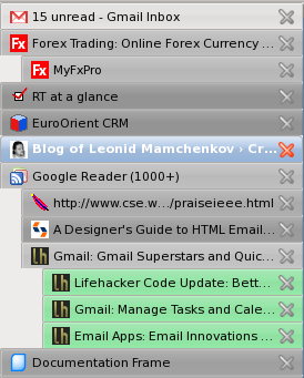
I spent about two hours going through the list of all installed pieces, upgrading outdated versions, changing old solutions to the modern alternatives, getting new tools, and so on.   I have to say that after that effort my Firefox works faster, and it suits me better now.  One of the biggest changes from my previous setup became the use of Tab Kit extension.  Among its many features, it has the one that I’ve been passively looking for for a long time now – tab bar on the right side, instead of top, but not as a part of the sidebar, and with a tree view.  Combined with Aging Tabs extension, the result is exactly the way I wanted it.

(it is better in real life than it is on the screenshot)

Now when I open links from the site in the new tabs, these new tabs are organized in a tree like structure.  Tabs that I haven’t yet visited are highlighted in green.  Current tab is highlighted in blue, as usual.  And the rest of the tabs are coloured in different shades of grey, depending on how long ago I last viewed them.  Also, because the tab bar is separate from the sidebar, I can get an additional panel on demand, with an application that I need the most at the moment, without sacrificing my precious tabs.

And just in case you are wondering which other extensions I am using, continue reading for the list of all extensions, which was generated by one of the extensions on that list.

Continue reading Firefox extensions

Fixing Firefox with safe mode

Here is something useful I learned today.  Until recently I’ve been using Firefox 3 beta 5.  It was working fine for me after I found all replacements and upgrades for all the extensions that I need.  One of those extensions was CompactMenu (not giving a link for now).  This extension replaces the whole main menu (File, Edit, View, etc) with a single icon.  You can place this icon anywhere on your toolbars and when you click it, you’ll get a drop down with your main menu items.  Huge space saver.

Yesterday, I upgraded my Firefox to the latest and greatest stable version 3.  The update came as an official package from Fedora updates.  However, once I fired up the new Firefox, it notified me that CompactMenu was not compatible with this version and so it was disabled.  Can you guess where I ended up?

Exactly.  No menu and no way to get to the menu.  I tried uninstalling the extension, intalling another version of it, unintalling it again, cleaning up options in about:config, customizing the toolbars, and so on and so forth.  Nothing worked.  And so I Googled.

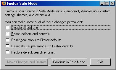
It turns out that Firefox has something called a “safe mode“.  All you need to do to get to it is start firefox with “–safe-mode” parameter.  Once it comes up, you’ll see the window as on the screenshot above.  One of the optios is “Reset toolbars and controls“.  It works wonders.  I got all the toolbars to their default state, and with View -> Toolbars -> Customize I could easily get them to the state I want.

Google AdSense blocks are back

It was almost half a year ago that I wrote these words:

Google AdSense is gone.  I’ve been planning to do this for a long time but never got down to it.  I don’t want to have any ads on my personal blog anymore.  And, it wasn’t making me that much anyway.

As a tribute to my inconsistency and greed, I wanted to let you know that Google AdSense blocks are back.  Currently you can see one in full post view, between the post content and the comments.  Another two are in the sidebar.  I’m still playing around with the ad types, sizes, colors, and locations, so don’t be too disappointment if they annoy you right now.

Why are the ads back?  What happened?  Well, first of all, I accidentally wrote a couple of very popular posts.   I wanted to see how well these posts can do financially.   Secondly, with the latest theme changes and a round of plugin shakes, there seems to be more activity on the blog (more people are coming in, they are standing for longer, and they do more – read, comment, bookmark, etc).  I started wondering if it’s possible to get a penny out of all you people.  So, you can say that this AdSense comeback is an experiment on my side, with some hopes of earing an extra cent.

Of course, I can be totally wrong and off the track (which happens pretty often, if you need to know), and all the positive activity that I’m seeing around here is fueled by the lack of ads.  If it is indeed so, not only will I earn any money with the ads, but I’ll also lose some of the audience (something I’d much rather not happen).

Anyway, call me what you want, but the ads are back. At least for now.  If they are too annoying for you, all I can suggest is start using Firefox browser with AdBlock Plus and AdBlock Filterset.G Updater add-ons.  You won’t see another web ad in your life…