Rebuilding mamchenkov.net – Step 1 – Ideas

It’s that time of the year again, when I am looking for more inspiration, when ideas are brewing, and when I feel this uncontrollable urge to change the appearance of this blog.  However, this time I want to do more than that.  I don’t just want to get another theme.  I want much more than that.  In fact, I want so much that this time I am sure I won’t be able to do it in one big step over a weekend.  I want a re-make.  Re-birth.  A complete makeover.

I decided I will take it slowly. Because otherwise I’ll lose passion soon and the initiative will die.  I won’t work on it somewhere else in hopes of finishing and releasing it one day.  Because then it will drag forever.  I’ll do it step-by-step, I’ll do it publicly, and I’ll document the path.  Just so that I get a better understanding of what is involved and why I decided to make certain things a certain way, and for someone else to hopefully learn of this experience.  And there is another, hidden, you wish, hope.  That someone will watch me suffer and will step up and help.   Not begging yet, though.

So, step 1.  Ideas.  Here is what I want with the new site.

  1. Focus.  I started this blog a long time ago.  It was about everything.  Then it spawned a few niche blogs, which lived and died, and folded back in.  While there will always be something outside the main topics to blog about it, I want to focus this blog around my primary topics of interest.  Which are: technology and movies.  Technology as in programming, system administration, Open Source Software, web work, social media, etc.  Movies as in movie reviews, trailers, trivia, etc.  I’ll also often blog about my personal life, things that happen in Cyprus, this, and that.  But that shouldn’t be the primary focus.
  2. Goals.  This blog was always my personal place on the web.  It didn’t really have any goals. Probably, that’s because I didn’t have any goals on the web myself.  And now I do.  And I want this blog to reflect it.  So, what are my goals on the web now?  Earn money.  I don’t want to completely lose the personal touch of this blog, but I think it can make way more money than it does now.  And there are two ways it can earn me money: by finding me better jobs (either full-time office jobs or once off consulting gigs or anything in between), and by ads.
  3. Presentation.  There are more than 4,500 posts on this blog.  That’s a tonne of links, images, videos, and code snippets.  But all of it buried in the archives with no easy way of finding it.  I want to change the presentation so that posts of value swim up to the top.  Movie reviews come to mind.  They have poster images, and ratings.  They are tagged with actors and directors.  They have recommendations and comments.  But there is no easy way of getting to them.  I want to change that.
  4. Social web integration.  I spend a lot of time on the Web.  I have a number of profiles, accounts, streams, and portfolios all over the place.  I want to have better integration of this blog with my other places on the web, such as Flickr, delicious, Twitter, Google Buzz, Google Reader, and whatever else that might be at the time.
  5. Mobile.  More and more people are using mobile devices to browse the web.  I do more of the mobile browsing myself.  It’s a pity that I find browsing my own blog annoying when on the mobile.  This must be improved.

Now that I look at these ideas, written, in front of me, I already have a better understanding of all the changes that have to be done.   There is no magic theme or plugin that will just do all that for me.  And there probably isn’t even a combination of those.  It will take a number of trials and errors, some hand coding, some content fixing, some A/B testing, and some of something else to get there.

What have I done so far? I got some new ideas yesterday by installing a number of themes and playing around with them.  All of them was online and in real-time, so some of you were probably confused.  You’ll see more of that in the near future.  I’ve also slightly rearranged the categories – moved technology categories under a parent of Technology, removed Blogging category (which fits under Web Work anyway), and a few other minor changes.  I’ve installed some more plugins and added a few more rules to the ever-growing .htaccess file.  I won’t go into details now, since that’s something I’ll have to re-work soon anyway.

What’s next? My mind is busy working on the visual concept.  It doesn’t share thoughts with me yet, but I can feel the buzz.  I’ll give it some time.  In the meantime, I’ll fix and tune a few things around.  There is a lot of mess to clean and it will take a long time to clean it.  There is no reason to wait.  Also, to monitor the progress, I’ll need to tune my Google Analytics setup.  Goals, conversions, funnels, landing pages, blah, blah, blah.  I’ll share the details with you, once I have an idea what I am doing.

Stay tuned for more news from the fronts.  Here I come…
On the future of Adobe Flash

There is a lot of rumble going around the Web now on the future of Adobe Flash.  Some say that Flash is here to stay.  Others believe that when HTML5 will be a norm, Flash will die out.  Others believe in some other technology or in the mix or in none of the above.  But everyone has something to say.

I just read a lengthy Slashdot discussion of this post by John Dowdell, who is working for Adobe in San Francisco, and who is not worried about Flash future.

There’s really no “HTML vs Flash” war. There are sure people inciting to create such a war, and individual developers may have strong practical reasons to choose one technology over another, but at corporate levels that drive strategy, all delivery channels are important Adobe territory, whether SWF or HTML or video or documents or paper or ebook or e-mag or film or packaging or whatever. Adobe profits by making it easier for creatives to reach their audiences.

On the other hand, a few month ago, back in Karlsruhe, Germany,  I was in the audience for the keynote speech by Patrick Lauke of Opera fame.  During that speech he presented a few developments – HTML5 and CSS3 among others – that clearly showed that there is a strong alternative coming for at least some of Flash’s functionality.  How soon?  The time will tell.

And yet there was yet another important announcement on the subject today.  Google Chrome releases blog mentioned a new version of the browser, released today, with integrated Adobe Flash plugin.  There was a link for more detailed explanations of such a change to Chromium blog.  It looks like there is something bigger going on:

[…] we are working with Adobe, Mozilla and the broader community to help define the next generation browser plug-in API. This new API aims to address the shortcomings of the current browser plug-in model.

I think that whatever the upcoming alternatives are, Adobe Flash is here to stay.  It won’t necessarily stay as we know it now. After all we now know a better Flash than we knew initially (read some Adobe Flash history).  But it surely is not going anywhere any time soon.

And if you need examples of stale technologies on the web, think Microsoft Internet Explorer 6.  It’s over 10 years old. Everybody hates.  Even Microsoft is advising everyone to upgrade.  Better technology exists for years now.  And yet we still have MSIE6 hanging around and no apparent way of getting rid of it.  And Adobe Flash, with all its limitations and shortcomings, is way better than MSIE6.

Finally, custom post types in WordPress 3.0 !

The rumour has it that WordPress 3.0 will have custom post types built-in.  These are excellent news!  This means that 90% of all web development companies will be able to drop their own, complex and ugly in-house built systems and switch to WordPress development.  And while WordPress code isn’t the prettiest thing you can find, it’s still better than most of that code that will be dropped soon.  And it’s small, which is also an improvement.

If you are not familiar with the concept of custom post types, these are basically your average posts + custom fields + theme and plugin support + steroids.  In short, these are beautiful.  It doesn’t really matter what your blog is about – cooking, political news, movies, or technology – you can always think of a way to make posts better than they are in the default installation.  For example, cooking recipes can have a section on ingredients, cooking instructions, and serving instructions.  You can have your theme support those sections and display them in a consistent and beautiful way.  Now you probably wouldn’t even bother.  You’ll do your best with built-in post editor and maybe, if you are half-insane, you’ll play with custom fields.  But that’s too technical, complicated, and not even remotely convenient.  You can try one of those few plugins available, but chances are you’ll either come across a limitation, or a plugin won’t work for you at all.  With WordPress 3.0′ custom post types your chances are better.

And why did I mention web development companies?  Because that is exactly what so many of them do – build web applications that work with custom object types (cars in automotive shops and rentals, real estate items, products with online shops, etc).  A lot of work is put into defining those object types, building searching functionality, promotion bits, nested categories, integrating image galleries and contact forms, and such.  Needless to say, most of this functionality is already available in WordPress, either built-in or via a plugin.  Custom data types though weren’t.  And now that custom posts will make it into WordPress, most of the average small company’s needs will be so much easier to take care of.

This is a much needed and long awaited bit of functionality and I am very excited for it to finally make it.  These will cause a new wave of activity around WordPress, and we’ll see more and more sites built with it.  Awesome!

Build for the mobile

I just had a revelation. An enlightenment, if you will.  You know how it happens – you think about a solution to a problem for a really long time.  Then you don’t think about it anymore. At least not consciously.  But your brain is still crunching.  You can feel it.  But if the solution is still not found, then get used to that constant crunching and ignore it.  And then you even forget it. And then, some time after, there is a Big Bang.  A huge flash in your head.  And it’s not the solution to the problem yet.  But it’s a sign and a reminder that your brain is still working on something you have long forgotten you had to solve.  That’s what I just had.

Being involved with a lot of web development, I was trying to figure out how to go about all those mobile devices.  Mobile Internet user base is growing fast and even today it is so big that it can’t be ignored anymore.  Gladly, most mobile devices run full blown web browsers with CSS and JavaScript support.  Some can even do Flash.  So it’s not like web development for mobile devices is something completely different from web development for desktops.

And yet, there are differences.  For the near future, these are the differences that I can think about:

  • Mobile devices have smaller screens and that’s not going anywhere.  Even if supported resolutions get higher and higher, the physical size of the screen won’t match the desktop screen any time soon.
  • Mobile devices have handicapped input.  Flip-out QWERTY keyboards are quite usable now and handwriting recognition is getting better by the day.  But mobile device is not and probably will not be as convenient for input as desktop computers.
  • Mobile devices have less processing power.  They get more power, but while they do so, desktop clients do as well.  And so the difference is maintained.  With more and more functionality being pushed out into client side, processing power is an important issue.
  • Mobile devices have unstable connectivity and higher bandwidth costs.  Again, with all 3G networks expanding globally and more and more free WiFi hot-spots installed everywhere, the connectivity problem is getting partially solved.  But it’s not going to be solved completely any time soon (coverage, higher costs, battery life are just some of the reasons).

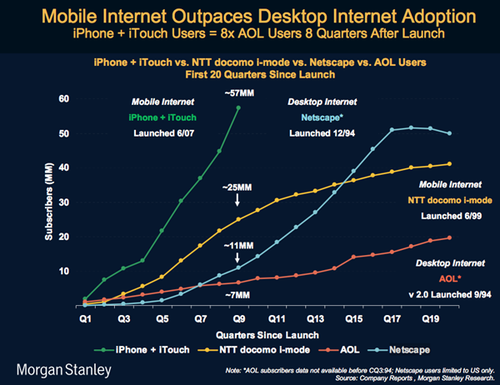
While there are probably other things you can put on that list above, even the ones I have there are enough to consider a different approaches when developing for mobiles.  And why should we consider them at all?  Well, here is an image that actually triggered that big flash in my mind that I spoke about earlier (shamelessly borrowed from Paul Kedrosky blog post).

Mobile Internet Graph

You (of course I mean “I”, “we”, “they”, and “you”) cannot ignore mobile devices anymore when building web sites and applications.  So, how should this problem be approached?  And now for that revelation, enlightenment that I mentioned earlier in the post:

Build for the mobile device first, then extend for the rest.

That’s not a new approach.  It’s something that has been used and recommend before.  It was just phrased differently.  It was along the lines of : limit resources in your development environment and you’ll get a much more efficient and resource aware application.  If a developer has only 512 MB of RAM on the machine he uses to write and test his code, chances of that application being much more effecient on a 4 GB server are higher than of application written on a 4 GB machine. ([*] citation needed)

If you build your web site or application for the mobile device, you’ll ensure most of these:

  • It works well with small screen sizes and lower resolutions.
  • It requires the minimum of input from the user.
  • It has exactly the right balance between client-side and server-side processing.
  • It supports a whole lot of browsers, even most of those browsers don’t exist on the desktop.
  • It has at least some optimization in terms of download size, client-side caching, etc.

And when your web project works on the mobile devices, it will be much easier for you to check for extra resources in the client’s browser (higher resolution, better browser, etc) and enhance behavior with more bells and whistles.  You’d probably won’t want to do this yourself anyway.

I think adding additional bells and whistles would be much simpler and faster, then removing and reorganizing things in the application that has been built for the desktop browser and now needs to support, or at least behave nicely with mobile browsers.

I would be very surprised if you actually read the post all the way down to here.  And just to thank you, I thought I should surprise you.  Most of the above post just came out from the top of my head, has no research, measurements, or supportive data.  It’s not even something I have discussed with someone else yet.  So, I suggest, you take it with the jar of salt, jar of pepper, and a pint-sized bottle of red hot chili sauce.

"Browser facts" from Microsoft

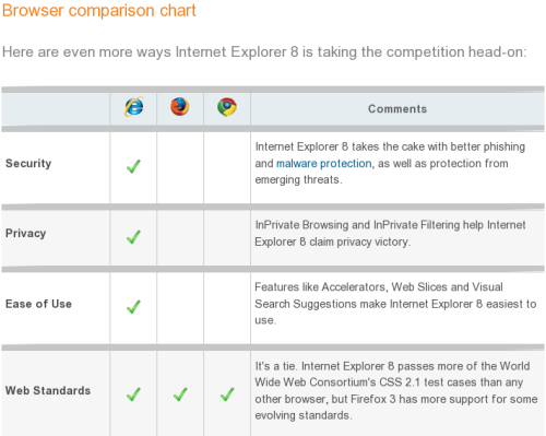
Google Blogoscoped brings to our attention Microsoft’s Browser Comparison chart.

MS Browser Comparison Chart

This is an excellent marketing campaign.  I am a big fan of using humor in the advertising, and this is a good example of it.  Everyone who has every tried to build a web page knows how horrible the state of the modern browsers is, and how even more horribly standing out Microsoft Internet Explorer is.  It’s so horrible that it is even hard to make it funny, but this time Microsoft succeeds.

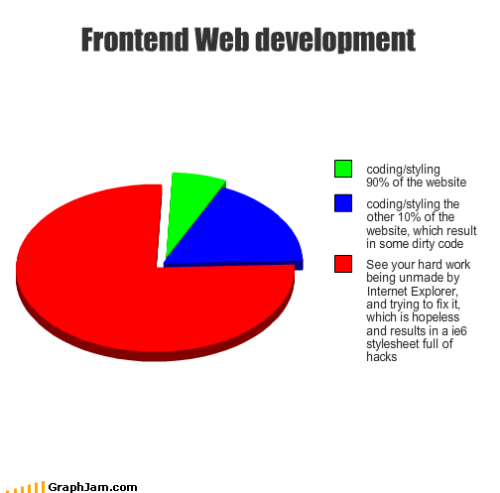
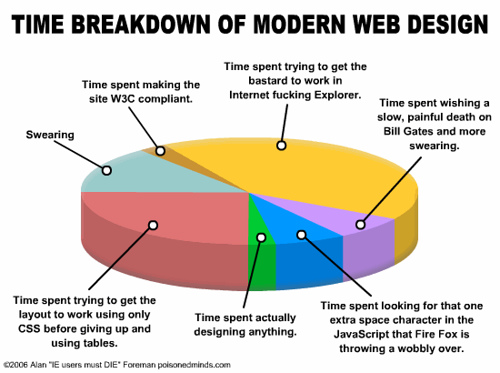
Just to balance it out a little bit, here are a few random charts that I picked from Google Images search results for “web developer time chart“.

Breakdown of time spent on web development

Frontend web development

Time breakdown of modern web design