Cyprus web sites observation

Cyprus web sites seem to be very sensitive about the weather.  Most of the web sites have an “About Cyprus” page, which often says something along the lines of “Cyprus has more than 300 sunny days a year“.  I do agree that Cyprus is pretty well covered with sunlight through out the year, but I wouldn’t go to any exact number of days.  Whatever.  That thing is just marketing.

But then, most of the same web sites have a weather forecast widget somewhere on sidebar.  What?  What for do you need one?  If it’s 300+ sunny days a year, the question of “What weather is it going to be today (or tomorrow)?” is not one of the frequently asked, is it?  It’s like asking “Is it going to rain today?” in UK.  The answer is always “Yes”.

And then, if you look closely on those weather forecast widgets and actually count the number of sunny days, you’ll get … what will you get?
Keep it simple, stupid

It is sometimes amazing how people behave.  Especially when they buy something and they get a choice of what they can get for their money.  Given the freedom to “get anything they want”, they often won’t stick with what they need, they won’t usually know what they want, and so they’ll go for as much as they can carry.  This might be a worthy technique for a supermarket, but it’s a bit different with web sites.

Yes, we (at my job) build web sites.  We do design, programming, hosting, promotion, maintenance, and many other things. And, yes, we can stack a web site with pretty much any technology or interface there is – forms, dynamic menus, AJAX, you name it – we can do it.  Can’t name any?  Good!  Because practice shows that if you can name something, you want it on your web site no matter if it needed or not.

It’s amazing how difficult it is to convince people  to stick with the KISS principle or make them understand that “less is more”.  Make your web site functional.  Put only things that you’d want yourself to use.  Study your statistics and see what people use and what they don’t.  Remove things that they don’t use.  Improve things that they use.  Stay focused and specialized – your web site is not an endless trash bin which you can throw everything into…

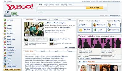
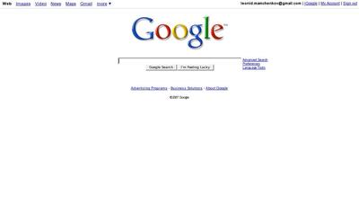
One argument that I often use, is of Google vs. Yahoo. When asked which company is number 1, Google’s leadership is never questioned.  When I confirm that Google is the authority, I go for examples.  How do you want your web site to look and feel?

Like this:

Yahoo front page

or like this:

Google front page

If these examples don’t convince, they at least plant a seed of doubt.  After these, it’s much easier to bend the conversation.

… and the award for the original web site goes to …

Chiefy for the www.f0bia.org !!!

I’m browsing through hundreds of web sites every day, and it’s been a while since I saw something that struck me as original. f0bia did it for me. With dark background, blinking cursor, and keyboard navigation it closely resembles UNIX command line. Yet it’s not just a show off, but a real blog with posts, search, RSS feeds, links, pictures, etc.

Well done!

Update: for those of you interested in technical details, the blog seems to be running WordPress and WordPress CLI theme.

The Microsoft experience

I smiled after reading this post.  It reminded me of the fact that in our office, designers use my laptop to test web sites on Microsoft Internet Explorer 6.  We have two guys doing the designs, and one of the uses Windows Vista, which runs MSIE 7.  Another one uses, I think, Windows XP, but with MSIE upgraded to version 7 too.  I heard it’s possible to have several versions of Internet Explorer running on the same Windows installation, but nobody around here knows how to do it or cares enough to experiment.

But the funniest thing in this whole story is that my laptop is running on Fedora Linux.

Current state of affairs keeps me silent

I am enjoying things that I do now, except that I can’t talk a lot about them. I am very much involved with a few companies right now and I surely can’t say what I am doing there. I have a few interesting plans that I can share just yet. And I have plenty of unfinished thoughts in my head, which should not come out, as they will probably hurt a lot of people as they are.

Exciting times, but not very much blogging fun…

In other news, the works have started on a new design for this blog. I don’t remember if I told you, so here it is again. Blog design matters. Even in our age of RSS feeds and email alerts. Blog design matters for the author. For me, at least. Currently, this blog’s design is not very representative. It’s very outdated. It does not show how I feel about blogging and does not help me be a blogger that I want to be. I don’t have links and tools integrated with my blog that I need, and the visuals of it do not inspire me.

That’s why there will be a radical change. This time the design will be done by a professional designer and it will be done specifically for this blog and will suit my needs and wants. It’s about time I invest into the new design after running my own and third-party themes for years.