A4Tech Glaser X6-6AK mouse

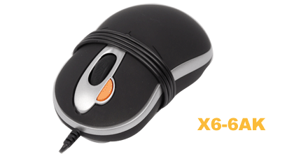
My old mini mouse that I used with my laptop is in the coma.  The left mouse button is not working any more.  So, I passed by a computer shop today to get myself a new companion.  The simplest mouse (out of the mini range) that was available was A4Tech Glaser X6-6AK.

It is a fine peripheral.

  • Small size (mini)
  • Short cable, which wraps around and a USB plug that folds into the bottom side.
  • Matte surface, which decreases slippage

It’s not the cheapest mouse in the shop (price tag just under 20 EUR), but it is a pleasure to use.

And there is one thing about this mouse and pretty much every other mouse that I’ve seen today that totally blows my mind an suggests to me that the end of human race is much closer than I thought.  Did you notice that orange button on the image above?  Do you have any idea what that button does?  I’ll give you a hint – it’s marked with “2X”.  I had to pause and pull myself together when I learned.  Here is the truth.
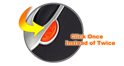
It’s a double-click button!  Say what?  Firstly, is double-clicking really such an exhausting activity that people need a separate mouse button for it?  And secondly, even if someone does need a button like that, do we really have to have it on ALL mice?  I mean, there wasn’t a single mouse in the shop that didn’t have this button.

I am officially puzzled and confused.
Google Checkout – an example to follow

My Gmail free space has been running out way too often recently.  I got bored with cleaning it up all the time and decided to upgrade my account.  While the process of buying something online is often trivial, I was pleasantly surprised by Google Checkout.  It was even easier than ever.  It felt like every little detail has been thought about.  Here are the things that I particularly liked:

  • Simple, straight-forward interface.  No bragging about coupons, special offers, promotions, and a trillion redirects.
  • Sensible defaults.  Google knows my name, address, and telephone number.  They can use this information to make order form submission easier.  And they do.  Including the default for the “name on card” field.
  • Clear information about the amount being charged.  Order submission button itself displays the amount that will be charged.  This way you can’t be confused by all the sub-totals, taxes, etc.  Crystal clear!
  • Excellent email notification.  The email clearly states what I have bought and when I will get it.

While none of the above sounds like rocket science, it actually is.  Go and buy something, enjoy the experience.

Apple Magic Mouse

Apple magic mouse

Here is a new bit of technology from Apple – Magic Mouse.  A mouse with no buttons, in my humble opinion, is as innovative as a car without wheels – people have talked about it, someone tried to make it, but until now it didn’t really work.  Will this one work?  I have no idea.

Pinging back your own posts

Weblog Tools Collection blog is asking if pinging your own previously published posts is a good idea.  Their consideration is the updated Google’s ranking algorithm which decreases the rating of sites to which it has ‘nofollow’ links – exactly the kind that pingback creates.

In my understanding, whenever you have a choice between improved search engine optimization (SEO) and improved user experience, always go for the user experience.  Pingbacks provide a valuable navigation path to updated content.  This is a way for the author to say that there is a development to the story or a much related content is available elsewhere on the site.

If Google, or any other search engine, penalizes such behaviour, I  am more than sure that this is very temporary. Even technically, making an exception to nofollow links within the same domain is a trivial change.

Getting rid of pingbacks to your own posts can and will seriously harm visitor’s navigation of the site.  And that would decrease your page views, incoming links, and everything else that is related to human activity.  Do you still have the question of pingbacks unanswered?

Google Reader : too user friendly?

I think of Google Reader as a very user friendly application. It clean and simple and only shows you things which you need to see.  Or does it any more?  Here are the options that I see for each RSS item:

Google Reader item options

Let’s see:

  • Add comment.  I can add comments to blogs posts and news and my friends can read those comments and reply and so on and so forth.
  • Add star.  Star is like a bookmark.  I can quickly find the starred articles with a single click.  And I can also share my starred articles by selecting so in the Settings.
  • Like.  I can “like” the article.  Other people can see that I liked it.
  • Share.  Share it with other people.
  • Share with note.  That’s like share and add comment in one.
  • Email.  This one is easy.
  • Keep unread.  So that I can easily find it and read later.
  • Add tags.  So that I can find it easily later and/or share it via Settings.

I am all for making sharing easy, but isn’t it too much?  I see it as a huge overlap in functionality.  Such huge that it gets confusing now.  What’s the difference between the “star” and “like”?  Do I “like” everything I “share”?  Do I “like” everything I comment?  Is it shared or “liked” if I just “Add comment”? How do I “star” or “share” everything I “like”? And so on and so forth.

I think this should be simplified in one action per option:  star, share, comment, email, tag.  If you want to bookmark, you “star” it.  If you want to share, you “share”.  If you want to comment, you “comment”.  If you want to star and share, then you actually click “star” and “share”.  If you want to comment and share, then add your comment and click “share”.  With boolean options everything comes back to the sane world – you either did it or not.

What do you think?