Mobilegs Crutches

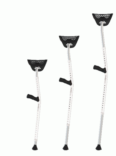
I hope I’ll never need to use any crutches, but if I ever do, I’ll probably settle for a pair of these.  I’ve shown them around to a few people, and each one of them who tried walking with the regular crutches, agreed that Mobilegs Crutches are superior in design.  I found them while reading “design is everybody’s business“.

2.  Purposeful – We design to solve a problem.

When one of Herman Miller’s designers, Jeff Weber, broke his foot, he realized how awfully-designed crutches were.  Not just uncomfortable, they can damage nerves, arteries, and tissue, and it’s easy to slip and cause more pain or more injury.  So he went about designing a better crutch (Mobilegs).  This is a perfect example of the purposefulness that informs the company’s designs.

Khan Academy – a MUST KNOW!

I’ve heard about KhanAcademy.org a few times since about 2009-2010.  But I haven’t really explored it or learned much about it.  It was just one of those “good things” on the Internet, which was about education and which was a not-for-profit.  And now I can’t believe I’ve been missing out on it.  Wikipedia page describes the project in a rather dry language:

The Khan Academy is a not-for-profit educational organization, created in 2006 by Indian American educator Salman Khan, a graduate of MIT. With the stated mission of “providing a high quality education to anyone, anywhere”, the website supplies a free online collection of more than 2,800 micro lectures via video tutorials stored on YouTube teaching mathematics, history, healthcare and medicine, finance, physics, chemistry, biology, astronomy, economics, cosmology, organic chemistry, american civics, art history, microeconomics and computer science.

There you go.  A cheese slogan, a single guy, a bunch of videos on YouTube – what’s all the big fuss about, right?  Wrong!  Here is a better way to get introduced to the project – a TED talk by Salman Khan.

[youtube=http://www.youtube.com/watch?v=gM95HHI4gLk]

Continue reading Khan Academy – a MUST KNOW!

The Click Test – your own usability study group

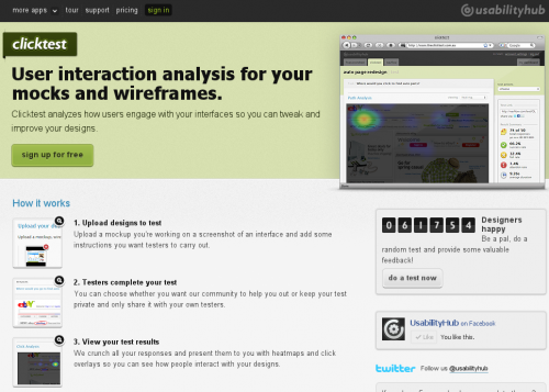
When I came across The Click Test this morning I had one of those “why oh why didn’t I think of this myself?” moments. Both the idea and implementation are very simple, but extremely useful for anyone involved with interface design, usability studies or web development. When you want to try out a design or user interface concept or element, when you don’t know which version works better, or if you want to find out which element stands out for most people, you need a usability study, and The Click Test gives you everything you need to do one quickly. All you need to do is upload your design and ask the question. It will then be shown to a bunch of people who will answer your question by clicking somewhere in the design. You’ll see the results of your study as a heat map of user interaction. That’s it.

There are applications, even in a form of WordPress plugin, that would allow you to do a similar study directly on your website. That’s not news. But heaving a crowd of people to use for your test – now that’s brilliant. Now you can actually test something before putting it on the live website.

Zoomii.com – The “Real” Online Bookstore

Via this CyberNet News post I got to Zoomii.com.  There is a saying about all new being well forgotten old.  And that’s exactly what Zoomii.com is about.
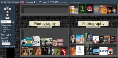
There is something magical about walking through a bookshop – touching books, flipping pages.  Especially, when you don’t know exactly what are you looking for.  Amazon has sort of taken it away.  You get in, get your stuff, maybe grab something that is recommended nearby, and leave.   Zoomii.com combines the best of both worlds.  You can still get stuff from Amazon shop at Amazon prices, but instead of visiting a rather cumbersome interface of their site, you can browse through a familiar bookshelf area.

The combination of a good design with intuitive interface makes it almost a “Wow!” site fo me.  It took me exactly three seconds to figure out how to use it.  And even if I wasn’t tech savvy, there is a little friendly popup that appears when entering the site, which tells briefly how to navigate around.  The control panel on the left is small, and has only the things that I care about – navigation, category selector, and information about my cart.  Brilliant.

The only thing that I wish Zoomii.com had that it doesn’t have (or at least I couldn’t find) is the option of choosing which Amazon shop to buy from.  If I could buy directly from Amazon.co.uk, it would be a 10 of 10 web site.  Hope, they will add this option later.

Sites like this should be taught to web designers and developers.  This is how the web should be – clean, simple, efficient, and intuitive.
Annoying software

Slashdot is running the post about annoying software.  The fact that Slashdot crowd mostly consists of computer geeks is sort of a guarantee for some interesting comments.

With my Fedora 9 saga I had to review and try a lot of new software.  Needless to say, I found quite a few annoying bits.  Here is a brief list, just to give you an idea:

  • Clock applet in Gnome. It shows calendar with Sunday being first day of the week.  If you don’t like it, you’ll have to recompile your locale to change it. This one is cancelled out though by an excellent support of Google Calendar (or, for that matter, any other web published calendar).
  • Metacity window manager in Gnome. Window titles are displayed in the middle.  This is really annoying for those of us who are used to seeing them on the left.  There is no option to change this setting either in GUI or in GConf.
  • Pidgin new message notification. I once had it popping up nice looking bubbles, but I don’t remember how I managed to do it.  I also don’t remember how I managed to break it.  And I have no idea to bring them back.  I really miss them though.
  • WordPress 2.5 post editing screen. It has been much reworked in the latest version and looks and feels so much better. However, the list of categories was moved from a really convenient location on the right of the screen to a really inconvenient location at the bottom of the screen.
  • FileZilla FTP manager. This one drives me nuts with server connections.  It either disconnects every 40 seconds when being idle.  Or it keeps multiple connections open forever and most FTP servers block me out temporary.
  • Request Tracker (RT3). Works perfectly with queues and tickets, but annoys the heck out of me when I need to do something with users.  Users aren’t first level citizens, like tickets.
  • SugarCRM. Excellent business tool, with lots of small annoyances, like not being able to set default user role, disable theme selector everywhere, change logos to company ones, lock down the functionality, etc.  Most of these are easily fixable.  But some aren’t as trivial as they may sound or seem.
  • Google Reader. This one annoys me a bit (but often) when I want to leave a few items in the feed unread and go deeper into archives.  Somehow it keeps marking everything I passed as read.

Now, what piece of software were you annoyed with recently?