Simpler Google Talk translations?

Google has recently added Gtalk bots that can do translations to various languages, mostly available with Google Translate.  While I’m all for helping people understand each other better (even though there are certain complains regarding the quality of translation), I think this functionality could have implemented simpler.

Disclaimer: I haven’t tried it out myself, I’ve only read about it and saw the screenshots.

The problem that I see with the implementation is it being one way.  The bots are named fr2en and fr2en.  Which means that in order to keep up with conversation in the language foreign to you, you’ll need to have two bots nearby, not one.  Why?  Because if you will ask a person in his language a question, he will likely reply in the same language.  So you will need to translate both to and from the language.  I think this should have been done with one bot, not two.
Undo for sending in Gmail

Google Blogoscoped runs this post speculating about an “undo” option for Gmail.  I’ve touched this topic some time ago in my “You can’t recall an email” post.  The base for that post of mine was purely technical.  What is sent is sent, and there is no way to get it back.

With another look on this issue, I see that technical side can be controlled to a certain degree.  Webmail providers (such as Gmail, Yahoo Mail, Hotmail, etc), can indeed delay the outgoing message by a few seconds.  Countdowns and disappearing buttons aren’t an issue either – we have plenty of technology these days (AJAX, Flash) to implement them.  And there is a certain demand for the functionality too – this can be judged by all those browser plugins and extensions, like the one mentioned in the Blogoscoped article.

Still, I’m standing on the side of “don’t do it”.  I think it’ll add to the confusion of the interface and the complexity of the system, without too much benefits in return.  I don’t think that we should have an “undo” for everything either.   And I think that the old way of “sorry, forgot to attach this document” works pretty well and sometimes makes people to actually read through and think over again about what is that they are planning to send out.

What do you think?  Would you like to see an “undo sending” button in your email client?

Keep it simple, stupid

It is sometimes amazing how people behave.  Especially when they buy something and they get a choice of what they can get for their money.  Given the freedom to “get anything they want”, they often won’t stick with what they need, they won’t usually know what they want, and so they’ll go for as much as they can carry.  This might be a worthy technique for a supermarket, but it’s a bit different with web sites.

Yes, we (at my job) build web sites.  We do design, programming, hosting, promotion, maintenance, and many other things. And, yes, we can stack a web site with pretty much any technology or interface there is – forms, dynamic menus, AJAX, you name it – we can do it.  Can’t name any?  Good!  Because practice shows that if you can name something, you want it on your web site no matter if it needed or not.

It’s amazing how difficult it is to convince people  to stick with the KISS principle or make them understand that “less is more”.  Make your web site functional.  Put only things that you’d want yourself to use.  Study your statistics and see what people use and what they don’t.  Remove things that they don’t use.  Improve things that they use.  Stay focused and specialized – your web site is not an endless trash bin which you can throw everything into…

One argument that I often use, is of Google vs. Yahoo. When asked which company is number 1, Google’s leadership is never questioned.  When I confirm that Google is the authority, I go for examples.  How do you want your web site to look and feel?

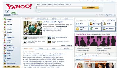
Like this:

Yahoo front page

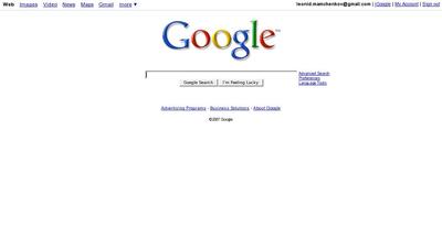
or like this:

Google front page

If these examples don’t convince, they at least plant a seed of doubt.  After these, it’s much easier to bend the conversation.

How busy is your desktop?

Accidentally, I stumbled upon a thought provoking post with the following words:

If you’re really using your computer, your desktop should almost never be visible. Your screen should be covered with information, with whatever data you’re working on. I can’t imagine why you’d willingly stare at a static background image– or even a background image covered with a sea of icons. Unless you consider your computer a really expensive digital picture frame, I suppose.

Well said!

I haven’t thought much about this before, but suddenly I realized that I can strongly relate to the above statement.  My desktop is never visible.  And it was always a bit awkward for me to pick a background image (I know use slide show, which cycles through all images in my Pictures/ directory) or a set of icons (I have a few in the corners of my desktop, but I never click on them, cause I never see them) to place on my desktop.

I’m going to set it to a solid color right now.  And I’m going to remove the useless icons too.

What about your desktop?  Does it look something like this?