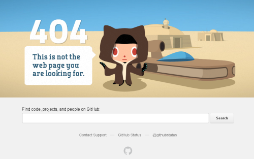
I’ve praised GitHub many a time in posts on this blog and in numerous conversations over a pint. Today, I found yet another reason to do so – GitHub error pages. We’ve all seen a parallax 404 by now, right?

Today was the first time I looked into the source code of the page. It greets one with the following words right under the HTML 5 Doctype definition:
Hello future GitHubber! I bet you’re here to remove those nasty inline styles,
DRY up these templates and make ’em nice and re-usable, right?
Please, don’t. https://github.com/styleguide/templates/2.0
The link provides even more goodness. The list of other (all?) GitHub error templates is provided with explanation of which one fires when, as well as an insightful list of rules that GitHub uses for building error pages. Have a look:
If you’re visiting from the internet, feel free to learn from our style. This is a guide we use for our own apps internally at GitHub. We encourage you to set up one that works for your own team.
Error pages should be built such that they require zero scripting, zero javascript, and zero dependency on anything whatsoever. That means static HTML with inline CSS and base64-encoded images.
The following are banned from every error page:
- All
<script> tags with an src attribute.
- All JavaScript that loads external data.
- All
<link> tags.
- All
<img> tags with an src pointing to a URL.
It’s things like that that keep me coming back and looking for more web development elegance all around GitHub.


