Slashdot is linking to Ekisto – a project to visualize online communities like if they were cities. So far there are only GitHub, StackOverflow and Friendfeed (really? Friendfeed?). I’ve seen plenty of data visualization, especially for GitHub, but I have to say that this is one of the most interesting ones ever.
Here is a quote from the About page that explains how it works:
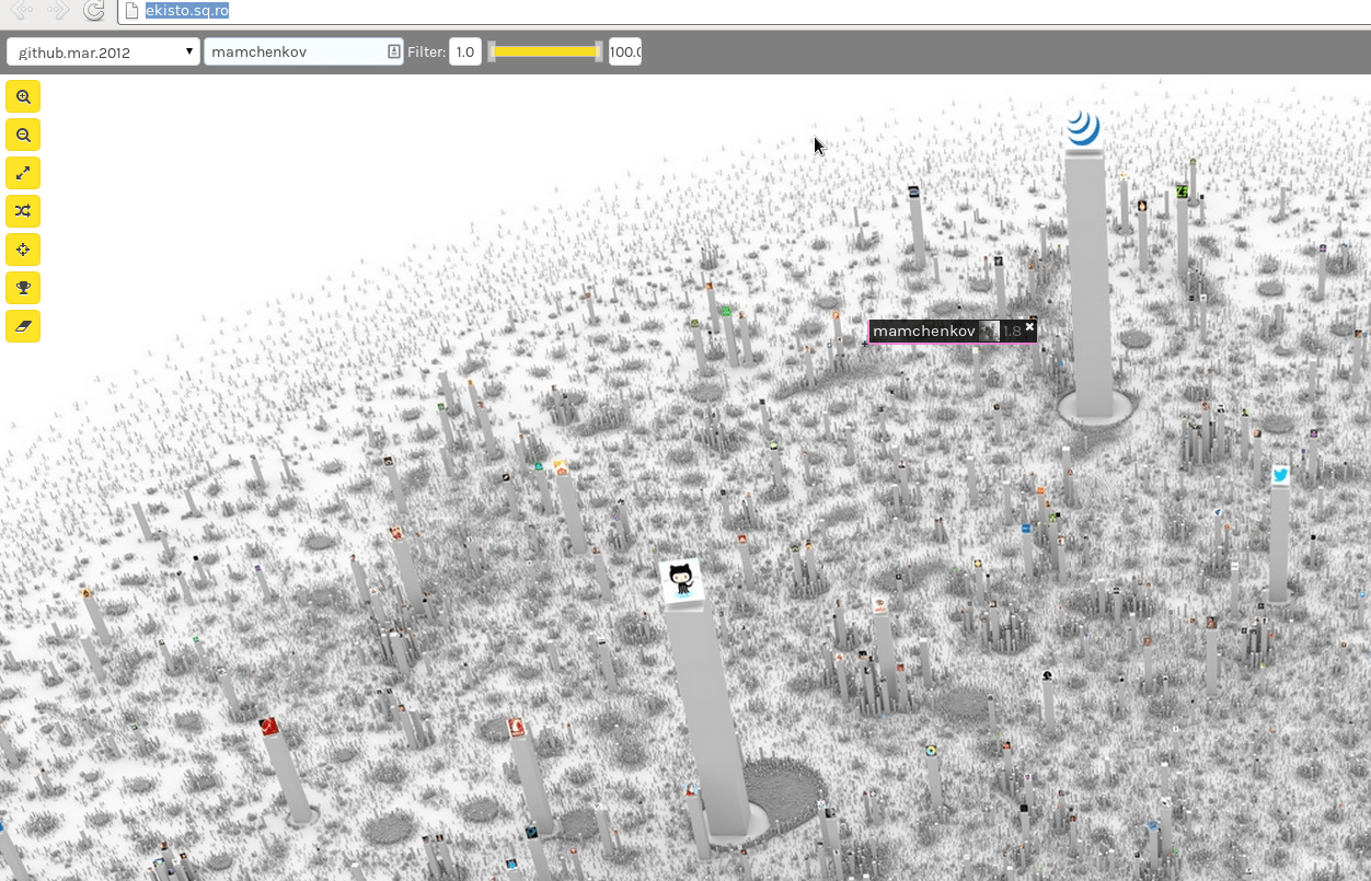
Ekisto comes from ekistics, the science of human settlements.
Ekisto is an interactive visualization of three online communities: StackOverflow, Github and Friendfeed. Ekisto tries to imagine and map our online habitats using graph algorithms and the city as a metaphor.
A graph layout algorithm arranges users in 2D space based on their similarity. Cosine similarity is computed based on the users’ network (Friendfeed), collaborate, watch, fork and follow relationships (Github), or based on the tags of posts contributed by users (StackOverflow). The height of each user represents the normalized value of the user’s Pagerank (Github, Friendfeed) or their reputation points (StackOverflow).