The 20 best wireframe tools


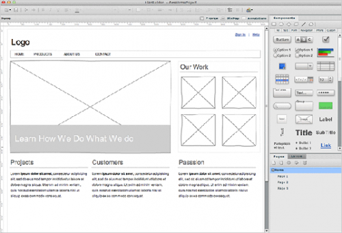
Creative Bloq lists 20 best wireframe tools.  The selection varies from free, through cheap, to expensive, and covers web-based, desktop, and mobile solutions.  Quite handy for those of us not involved in web design on a daily basis, but needing a sketch / mockup / wireframe tool once in a while.

The list includes the following:

  1. Wireframe.cc
  2. Moqups
  3. UXPin
  4. Fluid UI
  5. Balsamiq Mockups
  6. Axure
  7. Pidoco
  8. Visio (surprise, surprise)
  9. InDesign CC
  10. Photoshop CC (no surprise)
  11. Photoshare
  12. Penultimate
  13. Pencil Project
  14. OmniGraffle
  15. Gliffy
  16. MockFlow
  17. Frame Box
  18. FlairBuilder
  19. Justinmind
  20. HotGloo

Update (May 22, 2017): Also, have a look at this list of mockup tools.
The Difference Between UI and UX

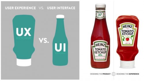
Via this article (in Russian), I came across this blog post discussing the differences between the design of the UI (user interface) and the UX (user experience).

In many cases, the incorrect expectation is that an interface designer by default understands or focuses on user experience because their work is in direct contact with the user. The simple fact is that user interface is not user experience. The confusion may simply be because both abbreviations start with the letter “U”. More likely, it stems from the overlap of the skill-sets involved in both disciplines. They are certainly related areas, and in fact many designers are knowledgeable and competent in both.

However, despite the overlap, both fields are substantially different in nature and – more importantly – in their overall objectives and scope. User interface is focused on the actual elements that interact with the user – basically, the physical and technical methods of input and output. UI refers to the aggregation of approaches and elements that allow the user to interact with a system. This does not address details such as how the user reacts to the system, remembers the system and re-uses it.

Practical Color Theory for People Who Code

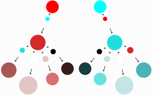
Practical Color Theory for People Who Code is an excellent guide to color theory for developers.  If you’d rather rely on simple formulas for color combinations, than on your own authentic eye, this guide is for you.

My lightbulb moment with modular design

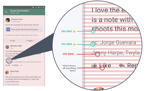
Cameron Lock, of Yammer fame, describes the complexities involved that led her and the team to a simpler, more modular approach to the mobile application design.  The most important bit after grouping everything into modules, practically, I think, is this:

We stopped defining margins between modules. Instead, all the spacing in the app would come from padding within the modules — specifically, top padding. Bottom padding would have worked, too; just not both. The key is to choose one of the two and stick with it.

Modular CSS : Block, Element, Modifier

I don’t do a lot of front-end work these days, but I am genuinely interested in approaches that help build modular systems, especially when the subject is something as messy and as context-dependent as CSS.

Recently, I came across the Block-Element-Modifier approach, aka BEM, which I find interesting.

If you’re not familiar with BEM, it’s a naming methodology that provides a rather strict way to arrange CSS classes into independent components. It stands for Block Element Modifier and a common one looks like this:

.block {}
.block__element {}
.block--modifier {}
.block__element--modifier {}

The principles are simple — a Block represents an object (a person, a login form, a menu), an Element is a component within the block that performs a particular function (a hand, a login button, a menu item) and a Modifier is how we represent the variations of a block or an element (a female person, a condensed login form with hidden labels, a menu modified to look differently in the context of a footer).

This follow-up article provides more details and examples.