Front page design is overrated

I was looking through my website statistics yesterday and I arrived to this decision – front page design is overrated.  There are, of course, different circumstances and such, but overall, I think this should be true for pretty much every content-based website, except the monsters like CNN.  If you are CNN, then, I guess, people just come to your front page to check up on things.  But if you are not CNN, or some other huge news outlet, chances are, you’ll get most of your visitors from the search engines.  And if that’s true, then I bet your front-page won’t be the landing page for all those visitors.  They will come directly to content pages, like articles, products, and so on.

Consider an example.  Yesterday, this blog saw 593 unique visitors.  The front page was seen by only 46.  That’s less than 8%!  Of course, days are different, and each website is different in its own way.  But I think that in general the correlation between the numbers will be somewhere there.  Around 10% of visitors will check your front page.  Most of them will check the landing page and leave (what’s your bounce rate?  70-80%?).  Some will continue to “Contact Us”, “Related Posts”, “Similar Products”, or search.  And then more of them will leave.  A few of those, who are still there, will probably check the front page by now.  By which time they probably already got what they wanted out of your website or lost all hopes.  No matter how beautiful your front page is, they are likely to leave now.  Dont’ think so?  What’s the average pages per visit metric for your website?  1.5-2?  There you go.

So, don’t bother too much about the front page.  Yes, it is nice to have a cool one.  Yes, it might be important for those direct visitors.  But if you are on a tight schedule or budget, concentrate on improving your content pages.

Sideshow – Cyprus web design company

For years I’ve been complaining about the web design situation in Cyprus.  Most web design companies here suck.  And most of the websites that they do suck even more.  Once in a while, though, I’d mention this or that website that was standing out.  Finally, I can mention a web design company that stands out and that makes websites that stand out too – Sideshow.

Yes, like every other company, they have their problems (front page of their website doesn’t validate clean) and they don’t do everything the way I would have done it (they are using Vimeo for videos, not YouTube), but I am still impressed with their work.  They use Drupal CMS extensively.  They truly know what social media is about, with Facebook and Twitter integrations and team tweets, their own blog, RSS feeds, and more.  Their design work is fresh and modern.  And their portfolio is shining.  Remember, when I was praising the new Cyprus Mail website? That’s the company who did it.  They even print their business cards with Moo, what more can I say?

I’m so glad I found them.  I have people left and right asking me where to go for a new website, and until now I have been very reluctant to refer them to any of the webdesign companies I know.  But now I have a proper reference.  And even though I haven’t worked with them personally, I think I am in the position to judge their work.  And as I said, I am impressed.  Respect!

P.S.: no, this is not a paid ad.  I truly am glad and impressed.

P.P.S.: if you are a web designer or web developer in Cyprus, they are hiring.  If there is one web company to work for in Cyprus, that’s this one.

Jim Carrey Official Website

Once in a while, I get this feeling that I have been involved with web development for more than ten years now.  And then I see a masterpiece that humbles me, and brings me back to the ground.  With supersonic speeds.  And it even hurts sometimes to the point that I don’t want to touch a computer ever again.  The official website of Jim Carrey had just that effect on me.

It is conceptually perfect and has outstanding execution.  I don’t even know where to begin…

Firstly, it matches my perception of Jim Carrey’s image and character.  I consider him to be a sad cloud of some sort.  He is a genius in comedy, and has also a very strong dramatic side to him.  This combination, I think, makes him into a very popular person who has nobody to talk to.  Not necessarily so, but you get the idea.  The website supports this perception of mine.  It is comical, yet sad, and very very original.

Secondly, the combination of visual art and music is stunning.   There is so much to look at.  Unlike most other sites where you spend a fraction of a second to analyze the page in front of you and navigate to the point that you needed.  Here you can stay on each page for minutes, looking at each and every little tiny detail.  Awesome!

Thirdly, it is quite interesting technically.  I am a strong supporter of the concept that good technology should be almost unnoticeable. It should do what it is supposed to do without attracting too much attention to itself.  And this website has a few good examples.  See, for example, how Twitter is implemented.  Visualized as a bird on a tree, with Jim’s face, that speaks out word by word his latest tweets.  How awesome is that?  I bet you’ve seen a billion Twitter integrations to all sorts of websites till now, but you haven’t seen one like this.  Or maybe you have.  I haven’t.  And Twitter integration is not the only example – there is the animation between different sections of the site, photo album, trailers of Jim Carrey’s movies, and more.  Bits and pieces are spread across the whole thing, leaving you know choice but to explore.

I think if we had much less of marketing and public relations online, the web would look more like this.  At the stage we are now, it seems only students and independent individuals can afford to have such websites (and I am not talking about money).  The rest are expecting the website to be “professional” and so on and so forth.  Which results in all those pieces of crap we have around.  I’m just saying that sites don’t get much more professional than this one.

Bravo to Jim Carrey for “approving” it, and for all those people who participated in creating it.  A masterpiece, an online piece of art.  Nothing less.

Example of webdesign misunderstanding

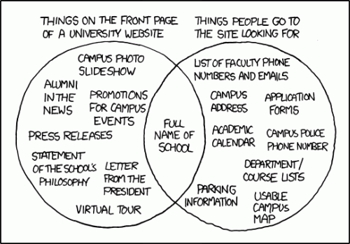
When building websites, a conflict often arises between what the owner of the website thinks is required on the site and what the visitors to such a website are looking for.  More often than not, the owner of the website has no idea of what is useful and what is not.  More often than not, the designer of the website doesn’t think about what is important and what is not.  The result – a website that even though is packed with information, is useless. An agony for everyone – owner, visitor, and designer.   This xkcd comic illustrates the situation nicely.