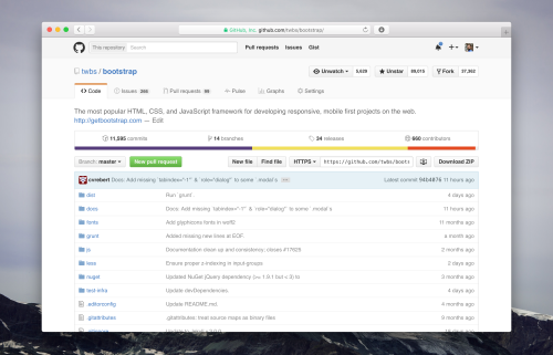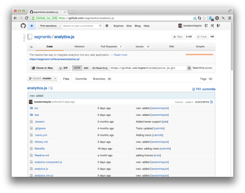
About a month ago, GitHub revealed its redesigned interface. It gets better and better with every iteration. But this time also got a feeling of deja vu, whic took me a while to figure out. And finally I did. The navigation menu went from right side to the top. And it’s not the first time it’s there.
Here is a link to the Refactoring GitHub’s Design blog post (I linked to it before), which explains some of the design decisions and the menu on the right. Among other things, there’s a screenshot of how things used to be before. Have a look.

It’s not identical, but it’s pretty close.


