More improvements for Movie Reviews

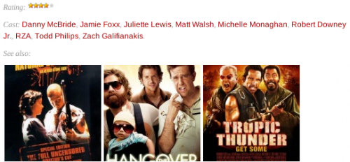
I’ve just added even more improvements to Movie Reviews.  If an article is a movie review, the list of assigned categories is not shown anymore.  Instead of the boring ‘All, Movies, 4 stars’ only the rating is displayed, using an appropriate amount of stars.  Images are way more fun to look at than text, aren’t they?

Also, in movie review articles, ‘Tagged with’ has been replaced with ‘Cast: ‘.  I know, I’ve used all sorts of different approaches to tagging my movie reviews, but the most recent direction seems to be tagging movies with people who directed, wrote, produced, acted, etc.  Hence the caption change.

And now for my favorite change so far.  Related movies are not displayed using poster thumbnails rather than the boring text.  It looks way better and makes me wanna click and read more.  Hopefully other visitors will feel the same.

Here is a screenshot that demonstrates the above described changes.
New look for Movie Reviews categories

Today I finally did something that I have been planning for a really long time – applied a new look for Movie Reviews categories.  Instead of them showing movie reviews like regular posts, they now show movie poster thumbnail and a star rating that I gave to the movie.  Clicking on the thumbnail brings you to the full review page, just like before.

Adding flags to Gnome keyboard layout switch

One of the little things that has been bugging me for a few years now is the Gnome keyboard layout switch.  I am using two layouts – English and Russian – and instead of having two nice flags, like in KDE, I had to live with ‘USA’ and ‘RUS’ letters in my task bar.  Not that big of a problem, but annoying.  Icons are much easier and faster to understand than text.  And all the other things in my task bar are graphical, so the text stands out too much.

Today I finally decided to do something about.  Thanks to this forum post I had a solution in hand which almost worked.  The steps were:

  1. Download en.png and ru.png icons into ~/.icons/flags/ folder.
  2. Run gconf-editor.
  3. Change the value of /desktop/gnome/peripherals/keyboard/indicator/showFlags to true.

The only thing that went wrong for me were the actual images.  Gnome scaled them to 24×24 pixels and they looked rater ugly.  So I created my own icons using Gimp.  I created a new image 24×24 pixels with transparent background and then dropped in the center of it the flag icon that I got from the FamFamFam icon set.  Saved the results back into the ~/.icons/flags/ folder and vuala!

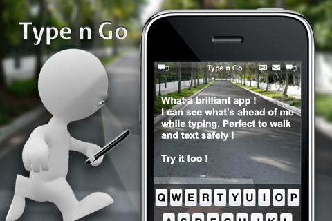
Type while walking problem solved

Even though I don’t ever type when I walk or drive, I can still aware of the problem.  And I think that this solution – a mobile phone application, which uses the camera to project the image in front of you as the background of your text entry – is really genius!  Simple, straight-forward, and utilizing available resources.

Via Download Squad.

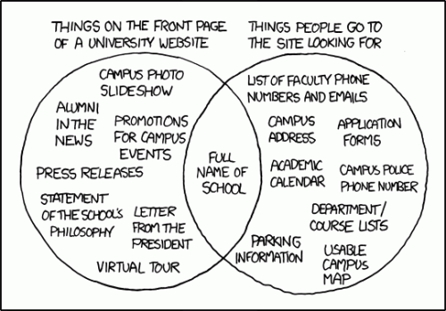
Example of webdesign misunderstanding

When building websites, a conflict often arises between what the owner of the website thinks is required on the site and what the visitors to such a website are looking for.  More often than not, the owner of the website has no idea of what is useful and what is not.  More often than not, the designer of the website doesn’t think about what is important and what is not.  The result – a website that even though is packed with information, is useless. An agony for everyone – owner, visitor, and designer.   This xkcd comic illustrates the situation nicely.