Tag: user interfaces
SpinKit – spinners animated with CSS
The history of WordPress user interface
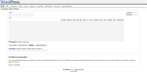
inMotion Hosting runs the article “WordPress through the ages“, which shows in a number of screenshots how WordPress user interface has changed from version to version. It is a long run indeed, and the one that brings a nostalgic tear to those of us who have been using the system for a while. Just look at how much it has changed, how much it has matured. From this in WordPress 1.0.1:
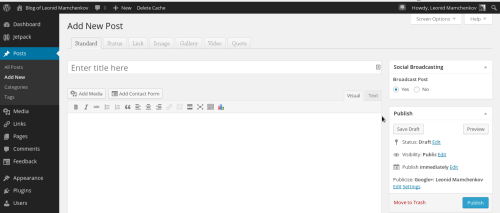
to this in the latest and the greatest WordPress 3.8:
I don’t think that there is a single item that was left untouched. Main menu has been reorganized a number of times, moved from top to the left, given sub-menu items, icons, and a variety of different fonts and colors. The editor has been through a tonne of transformations, adding the What You See Is What You Get (WYSIWYG) feature, icons, HTML preview, media uploader, which is a story of itself, and more. Custom post types are a fresh addition, but even they went through a bit. So did all the other elements – social networks integration, publishing options, categories, SEO, and more. And that’s just the post editing screen. As much or more has happened to the rest of the screens. Being redone in responsive layout, ready for smartphone and tablet screens comes to mind.
All these changes happened for a variety of reasons. Of course, people building WordPress learned better ways, got more feedback, and spent more time on it. But also the Web itself has changed. We are seeing faster networks, more powerful browsers, and richer interfaces.
Which brings me to another point. Pretty much every single time I was involved in building a website or an application, a non-technical client would raise the question of deadlines and phrase it like “When is this going to be finished?”. And every single time I have to explain that applications and websites they are not finite. They are more like kids – once you start, you never stop. It’s an ongoing project, with more and more features, fixes, and improvements. (There are exceptions, of course, but they are just that – exceptions). Most times, it’ll never be done. And one can’t just put everything into a single version, release it and forget about it. Instead, one should make a plan, a roadmap and decide what goes into each version, leaving some space and time for things that were unthoughtful at the time.
WordPress, like may other awesome applications, illustrates this nicely. WordPress 1.0 has been released and has been used by a lot of people. Was it done? No. More changes came in during 1.x, 2.x, and now 3.x version series. Is it done now? No, not by a mile. It is a much better system than it used to be. But there are still gazillion things to be done. And that’s a good thing! I wish such a lengthy (and successful) roadmap to every project.
And now, if you’ll excuse me, I’ll go back and drop that nostalgic tear of days gone by…
Why cards are the future of the web
On the average Web page, users have time to read a…
On the average Web page, users have time to read at most 28% of the words during an average visit; 20% is more likely.


