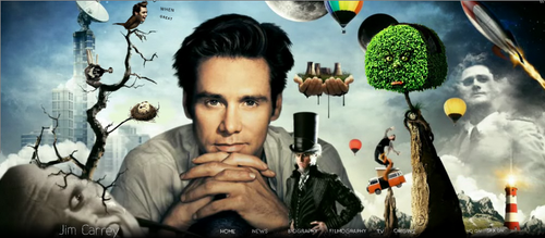
Once in a while, I get this feeling that I have been involved with web development for more than ten years now. And then I see a masterpiece that humbles me, and brings me back to the ground. With supersonic speeds. And it even hurts sometimes to the point that I don’t want to touch a computer ever again. The official website of Jim Carrey had just that effect on me.
It is conceptually perfect and has outstanding execution. I don’t even know where to begin…
Firstly, it matches my perception of Jim Carrey’s image and character. I consider him to be a sad cloud of some sort. He is a genius in comedy, and has also a very strong dramatic side to him. This combination, I think, makes him into a very popular person who has nobody to talk to. Not necessarily so, but you get the idea. The website supports this perception of mine. It is comical, yet sad, and very very original.
Secondly, the combination of visual art and music is stunning. There is so much to look at. Unlike most other sites where you spend a fraction of a second to analyze the page in front of you and navigate to the point that you needed. Here you can stay on each page for minutes, looking at each and every little tiny detail. Awesome!
Thirdly, it is quite interesting technically. I am a strong supporter of the concept that good technology should be almost unnoticeable. It should do what it is supposed to do without attracting too much attention to itself. And this website has a few good examples. See, for example, how Twitter is implemented. Visualized as a bird on a tree, with Jim’s face, that speaks out word by word his latest tweets. How awesome is that? I bet you’ve seen a billion Twitter integrations to all sorts of websites till now, but you haven’t seen one like this. Or maybe you have. I haven’t. And Twitter integration is not the only example – there is the animation between different sections of the site, photo album, trailers of Jim Carrey’s movies, and more. Bits and pieces are spread across the whole thing, leaving you know choice but to explore.
I think if we had much less of marketing and public relations online, the web would look more like this. At the stage we are now, it seems only students and independent individuals can afford to have such websites (and I am not talking about money). The rest are expecting the website to be “professional” and so on and so forth. Which results in all those pieces of crap we have around. I’m just saying that sites don’t get much more professional than this one.
Bravo to Jim Carrey for “approving” it, and for all those people who participated in creating it. A masterpiece, an online piece of art. Nothing less.


