Raphaël – JavaScript library for working with vector images

Raphaël – JavaScript library for working with vector images.

Raphaël is a small JavaScript library that should simplify your work with vector graphics on the web. If you want to create your own specific chart or image crop and rotate widget, for example, you can achieve it simply and easily with this library.

Raphaël [‘ræfeɪəl] uses the SVG W3C Recommendation and VML as a base for creating graphics. This means every graphical object you create is also a DOM object, so you can attach JavaScript event handlers or modify them later. Raphaël’s goal is to provide an adapter that will make drawing vector art compatible cross-browser and easy.

Raphaël currently supports Firefox 3.0+, Safari 3.0+, Chrome 5.0+, Opera 9.5+ and Internet Explorer 6.0+.

vis.js – a visual interaction system

vis.js – a visual interaction system

Vis.js is a dynamic, browser based visualization library. The library is designed to be easy to use, to handle large amounts of dynamic data, and to enable manipulation of and interaction with the data. The library consists of the components DataSet, Timeline, and Graph.

The vis.js library is developed by Almende B.V, as part of CHAP. Vis.js runs fine on Chrome, Firefox, Opera, Safari, IE9+, and most mobile browsers (with full touch support).

CakePHP GraphViz Models

I have completely and totally rewritten my old script that generates a graph of CakePHP models and their relationships.  Instead of pasting the code in here, I pushed all of its development to GitHub where it now enjoys a new repository.  Please have a look, try it out, and let me know if it does or doesn’t work for you.

The major changes in this version are:

  • Rewritten as CakePHP Shell instead of being a standalone madness script.
  • Got rid of all dot markup. Utilized Image_GraphViz PEAR package instead.
  • Added support for old and new CakePHP versions (1.2, 1.3, and 2.0).
  • Added option for using only real models (via className property of the relationship) or sticking with the old behavior.
  • Added a bunch of options for tweaking GraphViz output.  And now it’s obvious where to edit them, in case you need more.
  • Improved the styling of the graph a bit – fonts and colors.
  • Improved documentation.

As a side effect improvement, now that it is a native CakePHP Shell, it’s trivial to add to your project build process.

CakePHP + GraphViz = making sense of a numerous models

NOTE: THIS IS VERY MUCH OUTDATED! Read about the update or go directly to GitHub repository for the new version.


I have a task at hand.  I have to re-introduce myself to a rather large codebase.  It’s a project that migrated to CakePHP a couple of years ago and haven’t seen since.  There was a whole team of people working on it sense then, and now I need to make sense of all those changes that were done and help reorganize and refactor them a bit.  When I looked into CakePHP’s models/ folder, I was surprised to find 50+ models there.  Each and every one of them links to other models.  And documentation is practically non-existing.  How do I go about it?  I hack up a little script to help me out.

There is a really elegant and beautiful tool for graphing things – GraphViz.  If you haven’t heard of it, you need to drop whatever is that you are doing and familiarize yourself with GraphViz.  Right now.  Right.  This. Second.  You are missing out a whole universe until you do so.  I’ll wait.

Now that you are back, I just want to mention a very slick tool, which is a part of GraphViz package – dot.  It is a simple language in which you can describe graphs.  Sort of like “A goes to B, which goes to C”.   You specify your graph in a very human readable format in a text file, and then dot will transform that text file into an image format of your choice (PNG, JPEG, GIF, etc).  The primary beauty of this is that those text files can be generated automatically by using pretty much any programming language.

So here is what I did.  I assumed the following:

  1. Project documentation should be in app/docs/ folder.  That’s where I’ll put the script and that’s where it will generate the dot configuration, dot later will generate the graph of all my models and their relationships.
  2. Main project application folder is app/.  Models are stored in app/models/ folder.
  3. Project can have a number of plugins, which can have their own models, which I still want to know about.  Plugins are in app/plugins/ and if plugin xyz has models, they are stored in app/plugins/xyz/models.
  4. My project is under version control.  Specifically I use Subversion, but it’s easy to adjust the script to support other systems.
  5. I can get current project revision by running a command in shell.  For Subversion that is /usr/bin/svnversion.

I probably assumed a whole bunch of other things, but you can get an idea of how simple the setup is from the above ones.

Here is how I generate a graph of all models and their dependencies:

cd app/docs/
php -f graph.php > graph.dot
dot -Tpng graph.dot > graph.png

Obviously, I can’t show you the full graph from that system (it’s not open source, it’s not mine, and it will drive you insane in a matter of seconds), but here is how a small part of that image looks like.
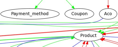
There is a different colour for each type of model relationship ($belongsTo, $hasMany, and $hasAndBelongsToMany). Each model folder is in a separate sub-graph cluster. There is a legend graph on the image. The current time stamp and version control revision are also imposed on the image for easier referencing.

And here is the source for the graph.php script. Feel free to modify any way you like. If you spot any major bugs or better ways of doing things, please let me know in the comments.

Continue reading CakePHP + GraphViz = making sense of a numerous models

Christmas season and blog stats

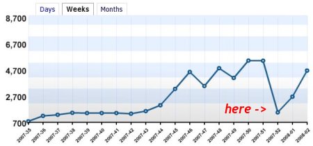
I don’t know exactly how all those online shops do during the Christmas seasons (probably they are blooming), but I can show you what two weeks or so of Christmas and New Year’s holidays can do to one’s blog statistics.  Here is a screenshot of weekly stats for my blog:

Weekly stats - Christmas edition

X-axis shows a few last weeks of 2007 as well as a couple of weeks of 2008.  Y-axis shows the number of visits this blog had for each of those weeks.  A home-made red marker with a word “here” tries to bring your attention to the celebration of Christmas and New Year represented on this graph.

As much as it was expected, that was quite a dive I must say.  Reasons?  I’d say there are only two:

  1. Many people are busy with shopping, celebrations, travels, and other holiday matters.  Mostly off-line.
  2. Many companies closed their offices and that minimized many employees’ access to the Web.

Gladly, things are rushing back to normal.