WordPress galleries – an underutilized gold mine

I think that one of the most underutilized features of WordPress is the image gallery.  It was added recently and all the proper announcements were made, but I still see too many WordPress based sites working too hard to display a bunch of images in post or page.  If you never made an image gallery in WordPress, I suggest you try it.  Maybe you are spending too much time solving your problem using something else.

Trying out the gallery is very easy.  Just attach more than one image to the post, without actually inserting those images to the post, and you’ll see a gallery tab in your media popup.  It will look something like that:
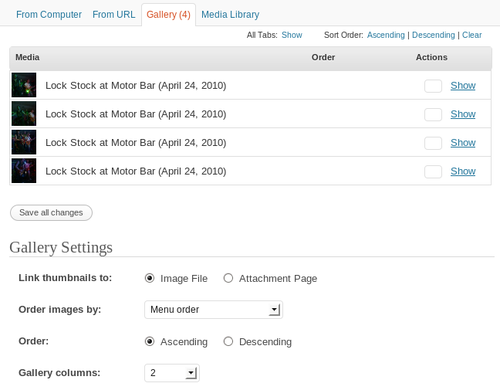
You can  manage the images in the gallery, their order, sorting direction, the size of the thumbnails, number of columns in the gallery, cropping options, and more.  It’s a very balanced compromise between flexibility (make it look the way you want) and ease of use (no coding required – all in mouse clicks).

More so, you can use some shortcuts in your blog posts and pages to control the appearance of the gallery.  There is a Codex manual which documents all options and provides examples of use.  Awesome, isn’t it?
Upcoming WordPress 3.0 in detail

I know I’ve mentioned the awesomeness of the upcoming WordPress 3.0 release before.  But there is more to learn.  Dougal Campbell was running WordPress 3.0-beta for a few days and wrote a post describing the new features in detail.

Also, if you add a post thumbnail which is as big as (or bigger than) your defined header size, the image will be used as a custom header specific to that post or page.

Rebuilding mamchenkov.net – Step 3 – Targets

Once I installed the monitoring of goals and gathered some initial data, it was time to start with the changes.  One of the obvious problems from the previous step was that I actually didn’t have my targets on the site.  The action points were missing – no easy way to read movie reviews and no easy way to know that I want people to hire me.  So these were the first things to change.

If you have a look at the site now, you’ll notice that the main menu is re-organized. Most notably it features Movies and Hire me! items.  Movies will take you directly to the list of my movie reviews, which I also improved by filtering out generic movie-related posts.  Hire me! link will lead you to a page which briefly describes what I can do and suggests where to find more information and how to get in contact with me.  Neither one of these action points are in their final stage yet – more changes are coming.  I just needed to start somewhere, so here they are. I have, of course, updated my goal tracking  to use the reviews page and added the new “hire me” goal.

While I was at it, I decided to fix a few other minor things that annoyed me.  Here is what I have done so far:

  • Tags clean-up.  This is still work in progress, but I managed to get a large piece of this work out of the way.  I had almost 2,000 tags in my database and many of those were too generic, tagging a single post.  I renamed and re-organized quite a few of them and now I am left with approximately 1,500 tags.  There are a couple of hundred more that will go away shortly.  This re-organization will make tags more useful and will help visitors find related content easier.
  • Added ‘About me’ section on the front page.  After the main menu reorganization I thought that I had too much of me in there.  “Contact me”, “Hire me!”, “About me”.  So I moved the “About me” into a section and made appear only on the front page.
  • Fixed the RSS image.  The default RSS image from Studiopress theme read “Grab our RSS feed”, but since I am publishing alone on this site, the “our” bit wasn’t making any sense.  I just cropped the image to have the widely recognized RSS icon.
  • Changed search results to feature excerpts instead of full posts.  Full posts were on by default since the last time I edited the theme.  I don’t use search too much, so I didn’t notice how annoying it was.  I tried several ideas to make it better and the only one that actually remains now on the site is excerpts instead of full posts.
  • Changed the tag line from “You just stepped in a pile of posts” to “Thoughts on movies, technology, and everything else”.  I think this one is more focused and that it should help a bit for the search engine optimization.

I’ve also experimented quite a bit with split testing and Google Website Optimizer, but realized that it is too difficult to use for the changes that I am working on now and decided against it.  Later on, when I will test smaller changes, it will come handy though.

Rebuilding mamchenkov.net – Step 2 – Monitoring

The best practices of web design and development suggest that I need to set up some goals and monitoring before I make any changes to the web site.  This way, I will be able to track how the changes affect the performance of the web site.

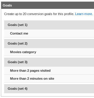
The problem is that right now my web site is not set very well for goals that I want it to achieve.  But insufficient monitoring is better than none, so I logged into my Google Analytics account and configured the following goals.

According to my own goals for this web site, as described yesterday, I want to get hired more.  The only way to track it now is to see how many people used the Contact me page.  I will eventually improve my contact details and contact form to be able to track more details.  Once that is done, I’ll reconfigure this goal.

One other thing I want people to do is read more of my movie reviews.  Again, there is no easy way of monitoring it now, so I just setup a goal for the Movies category.  This will probably get reconfigured later.

And just to have some generic goals for an overall picture, I added tracking for those who visit more than 2 pages  and for those who spend more than 2 minutes on the site.  That should be enough for starters.

VaultPress – yet another goodie from Automattic

Automattic – an awesome company behind WordPress, Gravatar, IntenseDebate, Akismet, and a few other – announced that they are starting up a new service – VaultPress.  While the details of the service are not completely clear yet, it looks like a real-time backup solution plus some security monitoring and automated updates.  This service is primarily targeted towards stand-alone WordPress blogs, not the ones hosted at WordPress.com .  Maybe WordPress.com support will come later, but for now those guys are settled pretty well anyway.

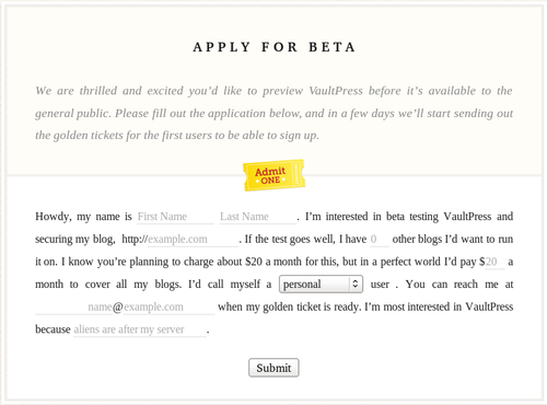
If you want to try VaultPress, it is in the invite-only stage now.  You can request an invite.  And while you are there, please do enjoy the beautiful form, which doesn’t follow the conventional “captions, fields, and the submit button” concept.  That’s what happens when you have a good web designer around and enough sense to let him work.