Google Public DNS announced

Google announced a Public DNS service, which is extremely easy to configure and which will improve your web browsing speed and security.  This service is not revolutionary however.  There were a few ones before, and the one that seems most popular these days is OpenDNS.  In case you wonder what’s the difference between OpenDNS and Google Public DNS, take a look at this Google Groups discussion.

From the end-user point of view:

Right now the difference is that Google Public DNS does not use any sort of redirection or display any ads. If a host (domain name, web address, etc…) doesn’t resolve, it will just fail. With OpenDNS, they hijack these failures and redirect you to a search page that displays ads and makes them money.

From the administrator or customer point view there are things like stats, control panels, and more – all in OpenDNS.  Google Public DNS seems to be focused differently. At least for now.

Update: Jason Kottke explains why Google did it.
Rollip – Polaroid your pictures

Most of the people who have digital cameras these days don’t know what Adobe Photoshop is, let alone how to use it.  And I think, given the complexity of any semi-decent image editor, most of the people would rather quit taking pictures than go through all the trouble of learning how to use such an editor.

But everyone I know wants their pictures to look cool.  So, what are they to do?  Well, there are plenty of sites on the web that can help you resize and colour correct your pictures, add borders to them and such.  But finding those that work for you is a bit of an issue.

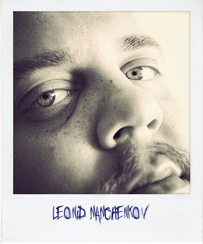
Today I got an email about one site that I tried and ended up playing with for a couple of hours – Rollip.   This one helps you to convert your picture into a Polaroid shot.  There are quite a few options that you can choose, but everything is quite easy and straight-forward.  Here is, for example, what I did with my own picture in less than a minute.

Leonid Mamchenkov (Polaroid)

You can try it yourself.  Play with different borders, fonts for the caption, special effects like coffee mug stains and soft focus.  All you do is choose, click, upload, and save the result or share it on the web.  Pretty cool!

Pretty soon you’d want a batch processing option, which unfortunately I wasn’t able to find.  But imaging how cool it would be to upload not a single picture but rather a photo album.  And in the perfect world, I wouldn’t even need to upload, but instead point to a photo set at my Flickr stream.  That would have been totally awesome.  Hopefully, the guys at Rollip will develop such functionality later on.

Oh, and by the way, if you want to see more examples, there is a Flickr group where people share their images processed with Rollip.  There are some pretty cool ones.

Gravatar – your face on the web

Gravatar

If you still haven’t heard of, or haven’t made yourself one Gravatar – you are missing out.  Gravatar is a globally recognized avatar.  And avatar is the little picture that shows up on all those blogs and forums that you comment on.

The thing is that you can get bored of uploading your picture to each forum and blog that you want to participate in.   What  you can do instead – is create yourself a Gravatar account and upload your picture there.

How does it work?  Very simple.  When you create your Gravatar account, you specify your email address (don’t worry, they won’t sign you up for tonnes of SPAM).  After that, when you comment at someone’s blog and you specify your email address in that comment form, you’ll have your Gravatar picture displayed by your comment once submitted.  Provided three things are true:

  1. You use the same email address in the comment form as the one you specified in your Gravatar account.  Because that’s how the blog will find your picture – by your email address.
  2. The blog or forum that you are commenting at utilizes the Gravatar service.  Of course, every blog and forum is free to choose their own avatar source, but more and more blogs are supporting Gravatar.  That has something to do with WordPress being one of the most popular blogging applications out there, and Automattic, the company behind WordPress, buying Gravatar service and integrating its support into WordPress out of the box some time ago.
  3. The picture that you have uploaded satisfies the age rating that the blog or forum requires.  People are free to upload all sorts of inappropriate images to their Gravatar accounts.  And that’s not what blog owners want to have displayed at their sites often.  So, there is a rating system which is used to specify how appropriate is your picture.

As for the picture itself, I suggest to use your own photo.  This makes your Gravatar unique – nobody will ever pick your picture for their Gravatar unless you are a celebrity or someone is madly in love with you.  And you’ll also recognize your own picture much faster when scrolling through a long discussion which you participated in.

The cool things about Gravatar are:

  • it’s free
  • it supports multiple email addresses (so if you have several identities on the web, you can manage them all from the same Gravatar account)
  • it verifies your email address to make sure it’s you and not somebody else
  • it’s integrated with WordPress out of the box and available as plugin for many other content management systems

What else are you waiting for?  Go get it!

Gmail gets Tasks/TODO

Many of us, Gmail users, have been waiting a really long time for this, but now the wait is over.  Gmail blog announced task manager / todo list in Gmail via Labs extension.

We put your tasks in the same kind of window as chats, so they’re visible while you’re scanning your inbox, reading mail, or searching (and in Settings, too!). Just pop your list out into a new window to use Tasks outside of Gmail.

To enable Tasks, go to Settings, click the Labs tab (or just click here if you’re signed in). Select “Enable” next to “Tasks” and then click “Save Changes” at the bottom. Then, after Gmail refreshes, on the left under the “Contacts” link, you’ll see a “Tasks” link. Just click it to get started.

Excellent news for this morning.

Google Reader updated interface

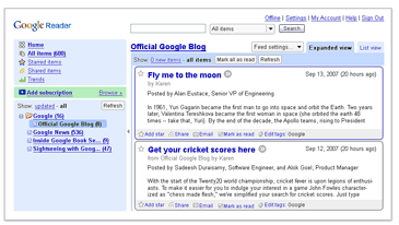
Google updated the design and interface of the RSS feed aggregator – Google Reader.  Here is a really small screenshot of how it used to look (stolen shamelessly from Google Reader front page – it seems like they forgot to update it):

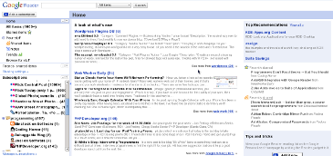
And here is a really small screenshot of how it looks now (I made this one, you can make your own):

In my opinion, the old interface was much better. Colors and borders helped to visually separate the sidebar from the main content area, as well as news items from each other.  The new design is much “separated”.  Also, there are a few minor quirks and bugs here and there, which will hopefully get fixed in the next few days.  However, one thing is great about this new release – speed.  The new Google Reader is much faster than the old one.  Extra responsiveness can’t hurt, especialy thos of us who go through hundreds and thousands of posts in a fast paced manner.