Kottke blog links to this Twitter thread with hilariously bad phone number forms used on the web, which started with this one:

User experience and web design horror stories …
Kottke blog links to this Twitter thread with hilariously bad phone number forms used on the web, which started with this one:
User experience and web design horror stories …
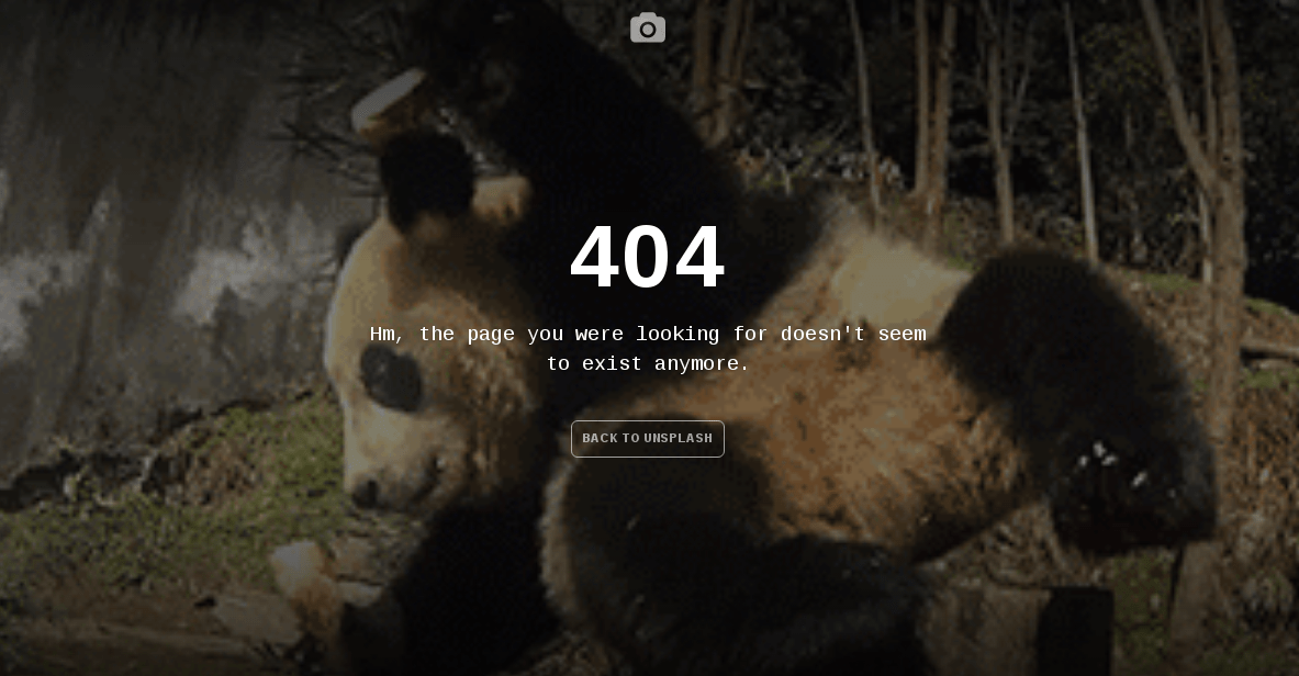
I’ve linked to Unsplash before. It’s a collection of free high-resolution photos. This time however, I’m linking to their excellent 404 page design. Every time you hit a 404 page not found error, you see a short funny fail video. Every time the video is different. Funny!

OK, this is pure gold. First of all, this is probably the greatest title ever. “10 Things I Learned About UX By Being Drunk“. Secondly, this post links to The User Is Drunk website, which is a brilliant idea and … a business, apparently. Thirdly, it reiterates once again over the things that couldn’t be recommended strong enough:
Excellent stuff!
If a horrible UI appears in a forest and no user experiences it, is it still a bad experience? #smashingconf @jaffathecake
— Becky McKimmy (@BeckyMcKimmy) April 29, 2015
Just a quick update on something that I wanted to do for quite a while now – I’ve joined the display of tags and categories. They are still separated in the back-end for me to manage the posts easier. I just figured out that for site visitors there’s no practical difference, and thus using two user interface elements where one can do the job is not ideal. The code snippet that helped me do that was borrowed (and slightly modified) from this Codex page. The only two change that I did were:
I’ve also thrown a copyright into the footer and a small welcome box to the sidebar, but those are just cosmetics.