Khan Academy – a MUST KNOW!

I’ve heard about KhanAcademy.org a few times since about 2009-2010.  But I haven’t really explored it or learned much about it.  It was just one of those “good things” on the Internet, which was about education and which was a not-for-profit.  And now I can’t believe I’ve been missing out on it.  Wikipedia page describes the project in a rather dry language:

The Khan Academy is a not-for-profit educational organization, created in 2006 by Indian American educator Salman Khan, a graduate of MIT. With the stated mission of “providing a high quality education to anyone, anywhere”, the website supplies a free online collection of more than 2,800 micro lectures via video tutorials stored on YouTube teaching mathematics, history, healthcare and medicine, finance, physics, chemistry, biology, astronomy, economics, cosmology, organic chemistry, american civics, art history, microeconomics and computer science.

There you go.  A cheese slogan, a single guy, a bunch of videos on YouTube – what’s all the big fuss about, right?  Wrong!  Here is a better way to get introduced to the project – a TED talk by Salman Khan.

[youtube=http://www.youtube.com/watch?v=gM95HHI4gLk]

Continue reading Khan Academy – a MUST KNOW!
The Click Test – your own usability study group

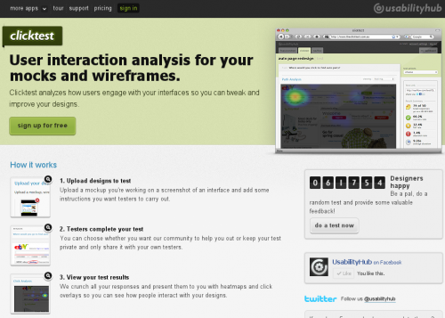
When I came across The Click Test this morning I had one of those “why oh why didn’t I think of this myself?” moments. Both the idea and implementation are very simple, but extremely useful for anyone involved with interface design, usability studies or web development. When you want to try out a design or user interface concept or element, when you don’t know which version works better, or if you want to find out which element stands out for most people, you need a usability study, and The Click Test gives you everything you need to do one quickly. All you need to do is upload your design and ask the question. It will then be shown to a bunch of people who will answer your question by clicking somewhere in the design. You’ll see the results of your study as a heat map of user interaction. That’s it.

There are applications, even in a form of WordPress plugin, that would allow you to do a similar study directly on your website. That’s not news. But heaving a crowd of people to use for your test – now that’s brilliant. Now you can actually test something before putting it on the live website.

Brian Shih on the new Google Reader interface

Brian Shih, an ex-project manager for Google Reader shares his thoughts on the new interface. I agree a lot with him. I also think that Google Reader should be integrated with Google+ and other Google projects, but the current version hurts that goal more than it helps it.

new sharing flow around the +1 button has actually made it harder to share. Where you used to be able to click one button, or hit shift-s to one-click share to your audience, you now need to:

  • Click +1 (no keyboard shortcuts for you)
  • Click the text box that appears that says “Share to G+”
  • Then choose your circle you want to share to (or let it default to public)
  • Then click Share

Keep in mind that on top of requiring 3-4 times as many clicks, you also now must +1 a post publicly to share it, even if it’s shared to a private circle. That bears repeating. The next time you want to share some sexy halloween costumes with your private set of friends, you first must publicly +1 the post, which means it shows up on your profile, plus wherever the hell G+ decides to use +1 data.

While I’m not too much concerned about privacy, I too find the new sharing way more difficult, time-consuming, and confusing.

The important field

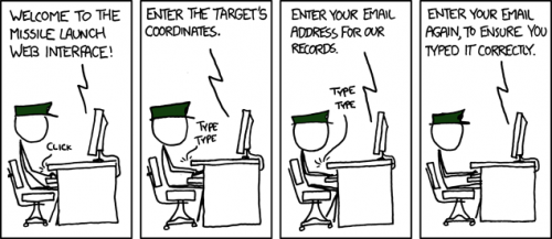
This xkcd comic strip nails one of the most frequent problems with modern web interfaces.  Web forms will ask you confirm and re-confirm anything and everything, but the actual important information that is easy to make a mistake with.  The rule of thumb here is, of course, only ask to confirm the password fields, because the data in them is not visible, so it does make sense to check that the user actually typed in what he thinks he typed in.  Asking to enter email address once again is stupid, because, email address is usually displayed in a visible field, because email address is a frequently used string, which most people type automatically, and because the user won’t bother with re-typing but will just copy-and-paste from a previous field.


Hellenic Bank updates interface, adds mobile banking

A couple of weeks ago Hellenic Bank clients received a notification through their bank mail that the web interface is about to be updated.  The update was schedule for September 3rd, but I guess it didn’t go as smooth as expected.  For the last two weeks the web banking was slow, unstable, and unavailable at times.  Today I finally managed to login and experience the new interface.  Here are the before and after screenshots for you to compare.

The new interface is far from perfect, but it is a vast improvement over the old one.   I’ve also noticed a banner advertising the mobile banking.  That sounded totally like a dream.  It’s hard to believe that Hellenic Bank even knows what a mobile banking is, let alone is capable of implementing one. I immediately decided to check it out – after all it was as simple as navigating to a mobile version of the website.  I tried to log into it, but was constantly thrown into a blank white page.  Not very surprising, but I am willing to give them time.  Given that there web site is still shaky, I doubt they have time to look at the mobile version of it as well.