Flickr update : liquid photo page layout

Flickr people once again outdid themselves.  An update to the design of the single photo page changes things to the better, much better.  Now you’ll the image filling almost entirely your screen, instead of a medium-sized thumbnail surrounded by all the navigational clutter.  Here is how it looks now.

And for those of you interested in the technical side of the story, there is a blog post explaining all the different challenges.  It might even be interesting for non-technical people to read, just to get an idea of how complex some seemingly simple things can be.

Foursquare’s adorable puppy

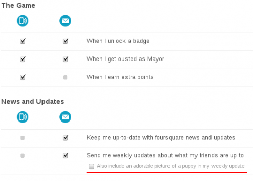
One thing I like about people who love what they do is that they usually don’t take themselves too seriously.  They can smile and joke about the things they passionately love.  Today I came across an example from Foursquare.  In the Settings screen about the notifications that Foursquare sends to you, there is an option to “Also include an adorable picture of a puppy in my weekly update“.  Here is a screenshot in case this will disappear with time.

Maintenance screen from BannersBroker.com

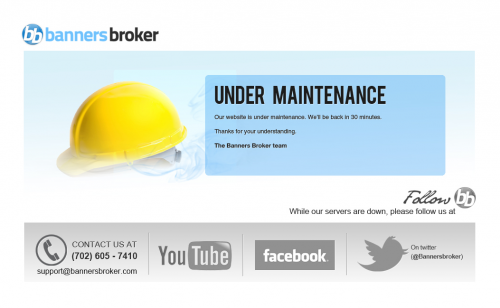
No matter how big or small you are, how much money you’ve invested into your infrastructure, how many levels of redundancy you have, or how many IT gods and gurus you’ve hired to watch over your website – the fact of life is that your website will go down, even if it’s for a brief moment.   And you should be ready for that moment.  Here is a good example that I came across recently – BannersBroker.com maintenance screen.

It looks simple and and straight-forward.  But if you are even remotely familiar with web development and design, you can appreciate how much thinking actually went into this one.  First of all, the mere fact that there is a maintenance screen, means that someone thought plenty about the website.  Secondly, it’s very well composed.   The big yellow helmet and large, bold “Under maintenance” letters both tell you exactly what’s going on.  It’s not a user error.  It’s not a crashed server.  It’s not something to report to the webmaster.  They are working on it.  Thirdly, it tells you exactly when to come back – in 30 minutes.  Fourthly, it still provides you with an emergency contact information – phone number and email.  Fifthly, it gives you something to do for thirty minutes that the site is going to be down – explore the company’s YouTube channel, Facebook page, and Twitter stream.  Sixthly, it reinforces the company brand.  Twice, in full color and full name, and in black-and-white small logo.  Seventhly, it doesn’t have any useless junk.  What else could you wish for?

To me, this is up there with Twitter fail whale and GitHub 404.

Infinite scrolling : no go!

Jeffro of WP Tavern fame asks an interesting question about infinite scrolling:

Thanks to Pinterest, many websites think it’s cool to provide the ability to infinitely scroll down a page. Over the past few weeks, I’ve noticed a variety of tutorials that explain how you can add this functionality to WordPress themes. However, I’m wondering if this is just one of those trends that will go away once Pinterest dies off. For sites such as Pinterest where it makes sense to have an infinite scroll, does it make sense to have that functionality on a regular blog or any other type of website?

There is also a poll attached to that post, which currently shows 60% (133 votes) consider infinite scrolling bad, 23% (52 votes) consider it good, and 17% (38 votes) have no preference.

I joined the “This is bad!” crowd.  I think that’s because I belong to the old generation of onliners, who at least had the time to think things over, and see how it was before and after.  I think that everything on the web should have it’s own URL, which shouldn’t change once published.  The content of the page should also remain pretty much the same.  If done so, searching for things and sharing things becomes so much easier.

Just think about it for a second.  Look at the archives of this blog. If I found something useful on the second page of February 2005 archives three years ago, it would still be there today.  I can bookmark a specific page of archives, I can send that URL to someone else, and it would still work years later.

Infinite scrolling page would give you only a single URL and bookmarking or sharing that would be totally useless, as its content would change and scroll away after a few updates.

Even for things like a blog stream, which presents newest items on top, pushing older updates into archives, pagination makes a lot of sense.  Once you know how many items per page there are, and an average number of posts per period of time, you can fast forward into an arbitrary date much faster.  For example, if I post approximately 4 posts per week, and I display 10 posts per page for the front page stream, all I need to do is get the URL of the first archive page – https://mamchenkov.net/wordpress/page/2/ – by pressing Next link on the front page, then do a quick calculation, and replace “2” with the calculated page number to quick jump back into history.  (I’ve used this technique quite a few times, when I needed to find something that I didn’t know how to search for, but new roughly the publishing date of. And I know I’m not alone.)

With infinite scrolling, you’d have to scroll and scroll for hours or days.

There are also other issues to consider – time control on the user’s side, increased CPU and memory resources required to handle bigger pages, browser cross-compatibility, and so on and so forth.

Having said that, I understand that most people probably don’t care about these things and find infinite scrolling very much a convenience.  Good for them…

P.S.: One place where I think infinite scrolling makes sense is in the image search results (like Google Images).  There, it helps to scroll through a whole lot of images in shorter time.

TripAdviser can be confusing

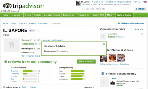
I’ve heard plenty of good things about the TripAdvisor website.   I’ve never used it myself yet, but I know that a few people that I trust with reviews do.  Today, I was searching for information on a restaurant and Google suggested that I check out this TripAdvisor page.  Looks good, doesn’t it?  Here is a screenshot of it, just in case it will change in the future.


Reviews, ratings, and even photos – that is all very useful.  But I needed more.  Given that I had no idea where exactly the restaurant was, I thought the most helpful details would be the address or at least a phone number.  A link with “More restaurant details” only told me that I’d need a reservation.  But again, no information on how to actually make the reservation.

Without that basic info, the rest is pretty much useless.  Gladly, that’s not the only website on the Internet.  This one seems to have both the address and the phone number…