Twitter is not a social network. Not primarily, anyway. It’s better described as a social media platform, with the emphasis on “media platform.” And media platforms should not be judged by the same metrics as social networks.
Social networks connect people with one another. Those connections tend to be reciprocal. Facebook even checks in on you now and then to make sure you’ve actually met the folks who are sending you friend requests. As a social network, its chief function is to help friends, family, and acquaintances keep in touch.
Media platforms, by contrast, connect publishers with their public. Those connections tend not to be reciprocal.
Tag: social networks
Share button – simple, light, flexible, and good-looking share button jquery plugin

Sigil Cycle
From xkcd, of course.
11 ways you can tweet better
- Use a hashtag to drive the conversation.
- Organize a live event using Twitter.
- Tweet the past as if it were the present.
- Have a celebrity take over your account.
- Join the conversation where it takes place.
- You ask the questions.
- Live-tweet a breaking news event.
- Team up with the co-stars and use hashtags to drive fans to a TV show.
- Use Vine videos.
- Use a custom timeline to curate the best content.
- Voting and displaying on air
Ekisto – visualizing online habitats
Slashdot is linking to Ekisto – a project to visualize online communities like if they were cities. So far there are only GitHub, StackOverflow and Friendfeed (really? Friendfeed?). I’ve seen plenty of data visualization, especially for GitHub, but I have to say that this is one of the most interesting ones ever.
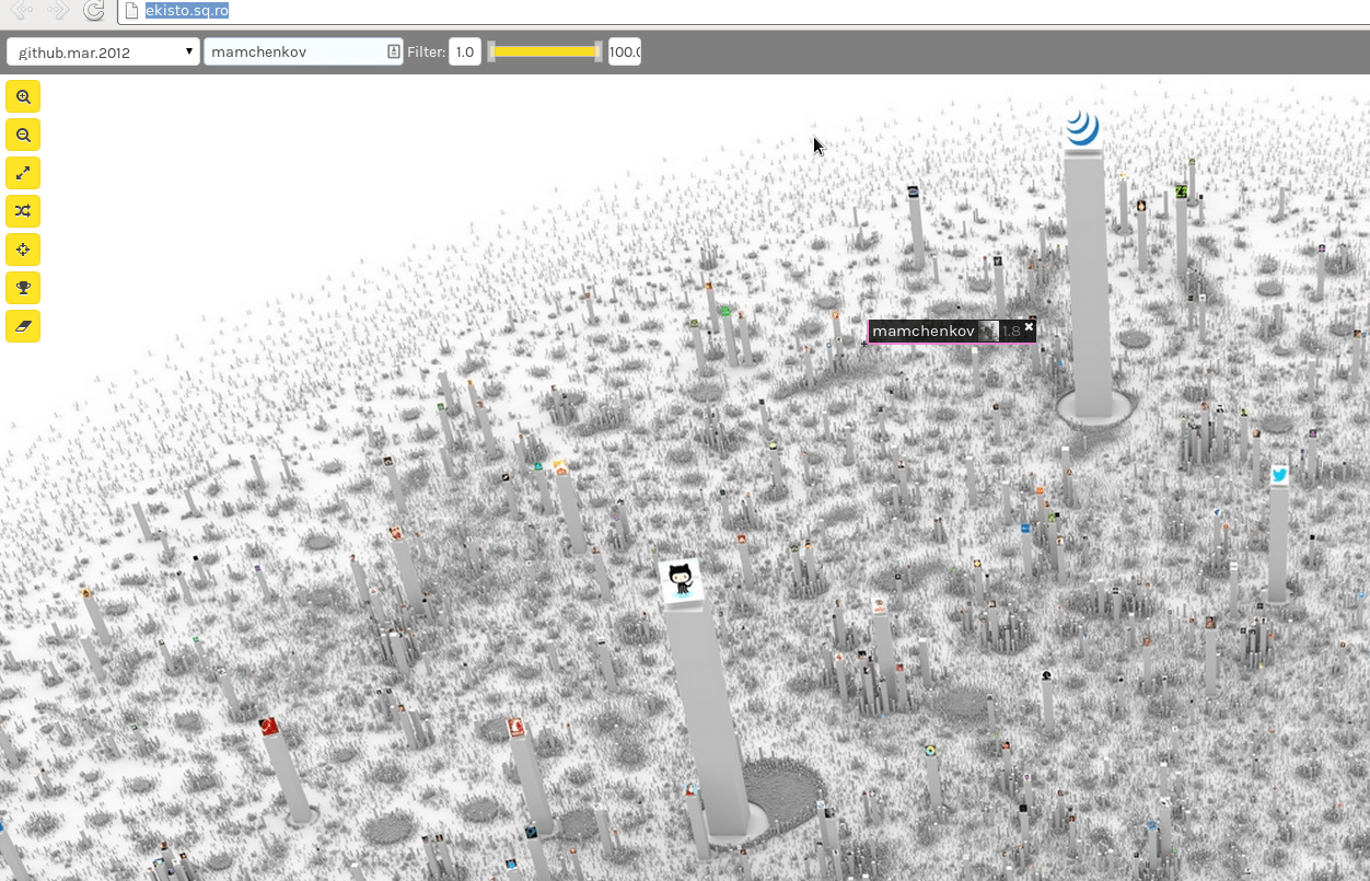
Here is a quote from the About page that explains how it works:
Ekisto comes from ekistics, the science of human settlements.
Ekisto is an interactive visualization of three online communities: StackOverflow, Github and Friendfeed. Ekisto tries to imagine and map our online habitats using graph algorithms and the city as a metaphor.
A graph layout algorithm arranges users in 2D space based on their similarity. Cosine similarity is computed based on the users’ network (Friendfeed), collaborate, watch, fork and follow relationships (Github), or based on the tags of posts contributed by users (StackOverflow). The height of each user represents the normalized value of the user’s Pagerank (Github, Friendfeed) or their reputation points (StackOverflow).