I just had a revelation. An enlightenment, if you will. You know how it happens – you think about a solution to a problem for a really long time. Then you don’t think about it anymore. At least not consciously. But your brain is still crunching. You can feel it. But if the solution is still not found, then get used to that constant crunching and ignore it. And then you even forget it. And then, some time after, there is a Big Bang. A huge flash in your head. And it’s not the solution to the problem yet. But it’s a sign and a reminder that your brain is still working on something you have long forgotten you had to solve. That’s what I just had.
Being involved with a lot of web development, I was trying to figure out how to go about all those mobile devices. Mobile Internet user base is growing fast and even today it is so big that it can’t be ignored anymore. Gladly, most mobile devices run full blown web browsers with CSS and JavaScript support. Some can even do Flash. So it’s not like web development for mobile devices is something completely different from web development for desktops.
And yet, there are differences. For the near future, these are the differences that I can think about:
- Mobile devices have smaller screens and that’s not going anywhere. Even if supported resolutions get higher and higher, the physical size of the screen won’t match the desktop screen any time soon.
- Mobile devices have handicapped input. Flip-out QWERTY keyboards are quite usable now and handwriting recognition is getting better by the day. But mobile device is not and probably will not be as convenient for input as desktop computers.
- Mobile devices have less processing power. They get more power, but while they do so, desktop clients do as well. And so the difference is maintained. With more and more functionality being pushed out into client side, processing power is an important issue.
- Mobile devices have unstable connectivity and higher bandwidth costs. Again, with all 3G networks expanding globally and more and more free WiFi hot-spots installed everywhere, the connectivity problem is getting partially solved. But it’s not going to be solved completely any time soon (coverage, higher costs, battery life are just some of the reasons).
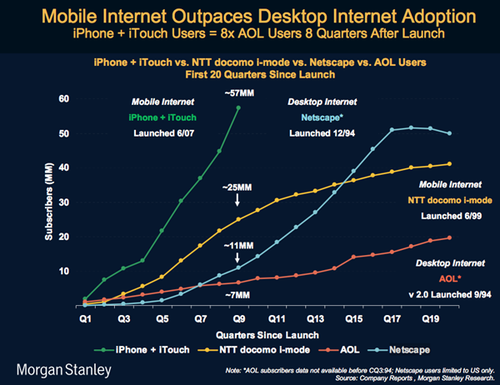
While there are probably other things you can put on that list above, even the ones I have there are enough to consider a different approaches when developing for mobiles. And why should we consider them at all? Well, here is an image that actually triggered that big flash in my mind that I spoke about earlier (shamelessly borrowed from Paul Kedrosky blog post).

You (of course I mean “I”, “we”, “they”, and “you”) cannot ignore mobile devices anymore when building web sites and applications. So, how should this problem be approached? And now for that revelation, enlightenment that I mentioned earlier in the post:
Build for the mobile device first, then extend for the rest.
That’s not a new approach. It’s something that has been used and recommend before. It was just phrased differently. It was along the lines of : limit resources in your development environment and you’ll get a much more efficient and resource aware application. If a developer has only 512 MB of RAM on the machine he uses to write and test his code, chances of that application being much more effecient on a 4 GB server are higher than of application written on a 4 GB machine. ([*] citation needed)
If you build your web site or application for the mobile device, you’ll ensure most of these:
- It works well with small screen sizes and lower resolutions.
- It requires the minimum of input from the user.
- It has exactly the right balance between client-side and server-side processing.
- It supports a whole lot of browsers, even most of those browsers don’t exist on the desktop.
- It has at least some optimization in terms of download size, client-side caching, etc.
And when your web project works on the mobile devices, it will be much easier for you to check for extra resources in the client’s browser (higher resolution, better browser, etc) and enhance behavior with more bells and whistles. You’d probably won’t want to do this yourself anyway.
I think adding additional bells and whistles would be much simpler and faster, then removing and reorganizing things in the application that has been built for the desktop browser and now needs to support, or at least behave nicely with mobile browsers.
I would be very surprised if you actually read the post all the way down to here. And just to thank you, I thought I should surprise you. Most of the above post just came out from the top of my head, has no research, measurements, or supportive data. It’s not even something I have discussed with someone else yet. So, I suggest, you take it with the jar of salt, jar of pepper, and a pint-sized bottle of red hot chili sauce.
 Via Design Language News.
