I do hate HTML emails with passion. They are always too heavy, often bloated, render horrible, and just plain annoying. I miss the old good days, when email clients were warning users that their signature was too long, spanning more than 4 lines. Today, everybody is sending out HTML emails whether they need to or not. Whether it’s for the signatures, corporate branding, or the “marketing value” or the “professional look”.
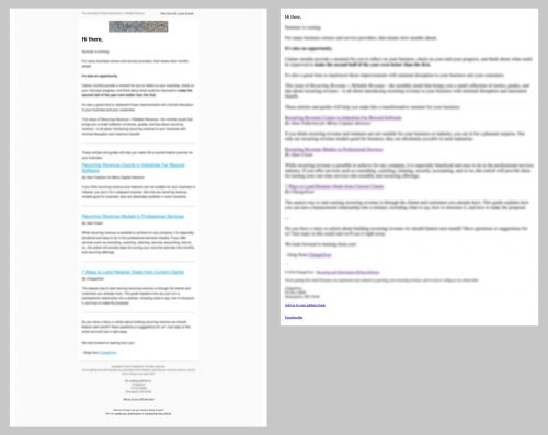
Finally, there is someone on my side of the fence, who actually tested the effects of HTML emails and suggests that plain emails are more efficient even for the marketing purposes. Read the whole thing – “Don’t Design Your Emails“, especially if you are involved with email marketing.
The plain email—which took no time to design or code—was opened by more recipients and had 3.3x more clicks than the designed email.
[…]
The plain, unstyled emails resulted in more opens, clicks, replies, and conversions, every time.
Replies to welcome emails were tripled. Cold emails were getting 30-35% open rates and 3% conversion rates, which is incredible.


