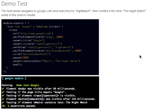
Nightwatch.js – browser automated testing done easy
Tag: browsers
testling-ci – run your browser tests on every push
browserling – interactive cross-browser testing
Font sizing with REM
The em unit is relative to the font-size of the parent, which causes the compounding issue. The rem unit is relative to the root—or the
html—element. That means that we can define a single font size on thehtmlelement and define all rem units to be a percentage of that.[…]
You might be surprised to find that browser support is surprisingly decent: Safari 5, Chrome, Firefox 3.6+, and even Internet Explorer 9 have support for this. The nice part is that IE9 supports resizing text when defined using rems. (Alas, poor Opera (up to 11.10, at least) hasn’t implemented rem units yet.)
What do we do for browsers that don’t support rem units? We can specify the fall-back using px, if you don’t mind users of older versions of Internet Explorer still being unable to resize the text (well, there’s still page zoom in IE7 and IE8). To do so, we specify the font-size using px units first and then define it again using rem units.
Front-end Developer Interview Questions
Front-end Developer Interview Questions
A list of helpful front-end related questions you can use to interview potential candidates, test yourself or completely ignore.

