The Intrinsic Value of Blogging

The Intrinsic Value of Blogging

Matt Mullenweg blogs on something I’ve been thinking about for a while too.  My thoughts aren’t distilled yet, but this does resonate with me plenty.  I think I have been writing either for the first or second person lately, not for both at the same time.

[…] write for only two people. First, write for yourself, both your present self whose thinking will be clarified by distilling an idea through writing and editing, and your future self who will be able to look back on these words and be reminded of the context in which they were written.

Second, write for a single person who you have in mind as the perfect person to read what you write, almost like a letter, even if they never will, or a person who you’re sure will read it because of a connection you have to them (hi Mom!).
WordPress 3.8 is available for immediate download

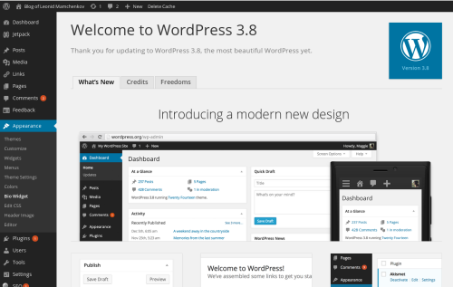
The bright new and shiny version – WordPress 3.8 – is available for download.  As I mentioned previously, the biggest change is the reworked administration area that now scales well to smaller screens, like those of smartphones and tablets.  It’s far from perfect, but at least it works now.  I’m sure there will be more changes and improvements in the upcoming versions.

WordPress-3.8

But that’s of course not the only change.   The administration area has changed a lot – more contrast, different icons, improved typography, and now even with color schemes.  Also, theme preview and management got changed quite a bit.  With the new theme management interface, the screenshots are larger, which, unfortunately, makes them blur out a bit until theme developers will update with higher resolution versions.

WordPress Themes : Flounder, with Colorful Post Formats

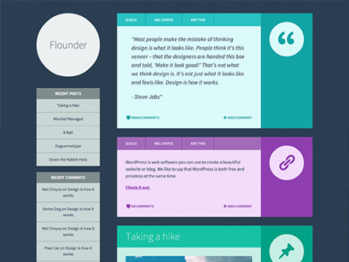
Via WPTavern I came across Flounder – a free WordPress theme with colorful post formats.  This looks rather awesome for use in personal blog, like mine.  Have a look.

flounder

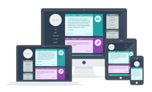
The colors are customizeable and the theme is responsive, as any new theme should be.  Here is how it looks on different screens:

responsive-flounder


I’ve installed it and tried out with WordPress’ Live Preview functionality – it looks pretty good.  There are a few things that I’ll need to fix if I am to use it.  Namely, the archives list, which has an item for each month in history, and the menu with a few submenu items.  The archives would work for a younger blog, but mine span from October 2001, which makes the archives list way too long.  Maybe switching to years instead would be a better option.  And the main menu looks ugly when there are a lot of submenu items.  Gladly, WordPress menu editor makes it trivial to change.

There also seems a slight variation on post formats between Flounder and Favepersonal – the theme I’m currently using.  For example, the Video post format doesn’t display a video on the homepage.  But, once again, these are trivial to fix, albeit with an SQL query rather than with a graphical user interface.

Google authorship

For a while now I’ve been trying to have my avatar appear next to the search results leading to my blog.   There are many guides online that I’ve tried, but nothing seems to work.  I followed all the steps – verified my email, had a high quality image, linked the site to my Google+ profile, used the “by” string next to articles and the “?author” parameter in the link.  Still, no image.

Today I was looking around to see if I could find any other tip.  And apparently, there is this page now, which clarifies my problem in the first step:

Make sure you have a profile photo with a recognizable headshot.

When you put it this way, then I can see why even the high quality image wouldn’t be recognized.  It’s not a full headshot.  It’s a tight crop that computers might have a problem with, while people see.  Hopefully, this will be enough to finally sort it out.  If it will, I’ll play around with the original avatar to see how far I can take it without loosing the recognition.