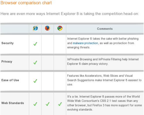
Google Blogoscoped brings to our attention Microsoft’s Browser Comparison chart.

This is an excellent marketing campaign. I am a big fan of using humor in the advertising, and this is a good example of it. Everyone who has every tried to build a web page knows how horrible the state of the modern browsers is, and how even more horribly standing out Microsoft Internet Explorer is. It’s so horrible that it is even hard to make it funny, but this time Microsoft succeeds.
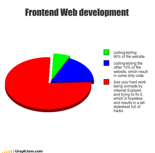
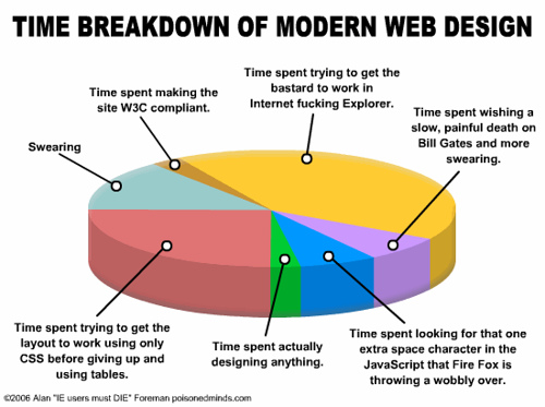
Just to balance it out a little bit, here are a few random charts that I picked from Google Images search results for “web developer time chart“.


Ha ha ROFL
They seem to be clarifying this in their Busting Myths tab in the same page
Seems more like a confession atleast about the previous version… ;) Now we’ll have to see what they’ll have to say about the next one IE9 :)
…about the next one IE8 when they release IE9 :)
Sanjay,
even if so, when the mention customization they say that a lot of the stuff that you’d want to add to Firefox with addon, they already have it built-in. While that might or might not be true (I haven’t used MSIE et), I see too problems with that.
epic :)