Dan in Real Life

I almost missed “Dan in Real Life“.  I wasn’t even planning to see it, since the poster is does not appeal to me and I’m not a big fan of Steve Carell.  I mean, he is OK, but he’s not someone who attracts me to the movie.  But anyway.  I ended up alone in the cinema.  And I’m glad I did.

This is a strong 8 out of 10.  There is no point at telling the story or bringing up any scenes from the film – most of them are rather traditional and have been seen before.  The movie follows the stereotypical love story with all elements such as close family involvement, road trip, hurting someone’s feelings, kids, rain, “go get her”, etc.  All these were present here too, and, I should say, there were very well done.

But the strength of the film is not in the love story.  It’s in other things.  For me personally, it was very refreshing to see a healthy family. And a big one a that.  This whole film was around a well managed and developed family – something they don’t show very often in the movies.  This film shows how parents can spend time with their children, how siblings can be good and supportive friends, how important are good family values and how they are passed along and cultivated.  This part of the film was so good that I almost could not believe my eyes.  That alone is worth the time.

And that wasn’t the only good part.  Somehow, the film is very romantic and sentimental.  Sometimes it’s said, sometimes it’s funny.  Sometimes it’s very social, and sometimes it’s very private.  And it “feels” very good too.  There is an almost natural balance of moods and transitions.  It’s not boring, and it’s not trying to squeeze any tears out of you, while, at the same time, it’s not trying to make you laugh so hard you fell from your chair.  It asks its share of questions, tries to provide some answers, and leaves a lot to think about, while still entertaining.

With all that, I am a little glad that it didn’t have a strong overwhelming story to tell.  It already offered enough, and with a good story it would be pushing its luck.  (However there are movies that do both).

Also, there is plenty of good acting in this film. It’s not brilliant or anything, but it is very believable and human.  There were some familiar faces cast for this movie, and those that aren’t so familiar, did equally good.

Overall : strongly recommended.

Online identity, relationships, Google, and Social Graph API

Web Worker Daily covers the release of Google Social Graph API. These are pretty exciting news.

With so many websites to join, users must decide where to invest significant time in adding their same connections over and over. For developers, this means it is difficult to build successful web applications that hinge upon a critical mass of users for content and interaction. With the Social Graph API, developers can now utilize public connections their users have already created in other web services. It makes information about public connections between people easily available and useful.

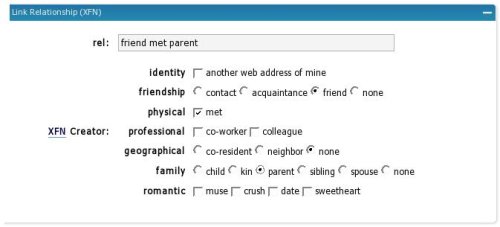
Even better news are that one of the systems supported by Google is XFN – XHTML Friends Network. This is exactly the same XFN that you see mentioned in your WordPress administration. When you manage blogroll (links) of your site, you can attach different XFN attributes to each link. The screen looks something like this:

WordPress XFN editor

If your web site also uses one of the properly built WordPress themes, which has profile=”http://gmpg.org/xfn/11″ attribute set in the HEAD tag (see XFN join page for more information), then you are all set to go. Google will index XFN information from your site and will make it available via its Social Graph API.

It’s good to see Google stepping into this area. It brings a lot of public attention to a very useful area of our online lives. Soon, we’ll see more social tools and services like rubhub and Plaxo Pulse.

Portability and flexibility win over performance

I noticed this ticket in WordPress TracChange enum to varchar and went in to see if there is any heated discussion.  The issue is around field types used in SQL scheme for WordPress tables.  Certain fields, such post status employed ENUM type with a set of allowed values.  The proposed change in the ticket is to convert them to VARCHAR type.

Why the change?  Well, VARCHAR is just a text field.  Anyone can put pretty much any string into it.  It has more flexibility for plugin developers and future changes – no need to tweak the SQL scheme.  ENUM on the other hand works a little bit faster.

Side note: I also thought that ENUM provides some extra data validation, assuming the ENUM field is set to NOT NULL, but it turns out this is not the case.  If you insert a record with a value which is not in the list, the NULL is used. 

The change has been approved, the patch was attached, and the world will see it in the next WordPress release.  Once again, it has been proven that human time is much more valuable than machine time.  Making it easier for plugin developers to extend and change the system has more value than that of a few extra CPU cycles to lookup in strings instead of numbers.

Odnoklassniki.ru – the way to do site messages

After all the comments I received for my  other post about Odnoklassniki.ru, I decided to expand a little bit on the positive parts of the web site.  The biggest success of it, except of course for thousands of people registering spreading the word of a mouth, is the messaging system.  And the whole messaging system, but the notification part of it.

For me personally, the proof of the success of the notification system lies in the fact that I actually like it myself.  Because I am usually in the opposite camp.  I think that we have enough messaging and notification systems as we are, for web sites to develop their own ones.  But, in this case, I have to say that it was done very well, and that it works possibly better  than any other alternative could have.

If you are not familiar with it, here is a screenshot (NOTE: the green border on the left was added by me, I’ll explain why in a moment).

Odnoklassniki.ru profile

This is my profile page.  Or, more accurately, a part of it.  This is what I see when I login.  There is the main navigation menu at the top (orange color), with sub-menu (in light gray) for the currently selected tab.  There is my picture, and some basic information, such age, last login time, etc – something other users can see when they visit my profile.  And, there is the notifications section on the left side (I put the green border around it).

Users of Odnoklassniki.ru can send each other messages.  As far as I know, they can’t do mass mailings or group discussions or anything like that.  It’s purely one registered user to another.  There is a limit on the size of the message – 1,000 characters.  There is a rich text editor with some formatting controls, such as text alignment, foreground and background colors, copy and paste buttons, and font face and size selectors.  Of course, smiling images and some commonly used icons (money, beer, etc) are also available.

The nice parts of the notification system are as follows.  Firstly, it shows incoming messages and status notifications in full.  It doesn’t tell you something like “you have 1 new message, click here to read it”.  It just shows it you right there and then.  Secondly, it queues all notifications and messages and shows them to you in turn one by one.  Not all at once or in a digest form, but one by one, in chronological order.  Thirdly, the system doesn’t hide the message after it showed it to you.  And it does not insist on you dropping whatever is that what you were doing and acting upon the message.  No.  It keeps the message in its full length on the left side of your screen until you act upon it.  For this you have two buttons underneath the message – close it and reply to it.  If you close it, the next message appears if there is one, or the notification area folds, so that not to occupy your screen space with nothing.  If  you do a reply, then a popup window appears with the name and picture of the person to who you are writing the message, and a rich text editor.  You can type your message there and press submit button.  Once your reply is submitted, the popup window is closed and the notification for the message that you were replying to is closed.

The way this notification system works is totally intuitive and out of the user’s way.  There is no way one could miss the notification while browsing around.  And, at the some time, it is easy to ignore it if you are in the middle of something.  Considering that many users of Odnoklassniki.ru are middle aged people and older, with somewhat limited web experience, I think the system does them a big favor by not being too stealth or too aggressive.

Back to the wider system of messaging, there are a couple of other nice bits to it.

First of all, it’s the archives.  Message archives are easily accessible through the top menu.  You can go through incoming and outgoing messages separately. And again, there is always the name and image of the user with who you communicated, and the full text of the message right there – no need of extra clicks and deep navigation.

Secondly, the way email notifications are done is also nice.  The system is tracking if you are online or not.  If you are, it won’t be sending you email notifications.  And, if you are not, it will still give you a chance to come back before abusing your mailbox.  It does not send notifications right away as they happen, but keeps them in the queue for some time.  If you aren’t coming, you will eventually get those to your email.  But I have to say that the balance of immediate notifications without emergency email abuse hits right on.  Perfect.

Now, why am I so detailed and picky about this messaging and notification system of Odnoklassniki.ru?  Because, I believe that much of its popularity lies within just this part of the site.  Many of the registered users don’t know how to use other messaging systems (ICQ, Skype, IRC, etc).  Many don’t want to share their email address.  And many try to avoid any extra email.  Also, there is a large diversity in age, current location, and computer skills among the users, so finding another common medium for all these people to communicate might prove rather difficult.  But with this one, it’s not.  Anyone can send a message, get a message, and reply to a message.  And that’s all that matters.  I know some people who use Odnoklassniki.ru as an instant messenger.  They chat with a whole bunch of people at the same time, using really short messages of plain text (no rich formatting), and they send them back and forth a few times per minute.  These people stay online for hours at a time!

Can the existing system be improved?  Absolutely.  Firstly, I think it should use left-aligned or justified text whenever the text of the message is shown.  Now it uses centered text for some reason.  Secondly, I think formatting should be a little bit smarter.  Paragraphs and links should be recognized better.  Text *like this* should be bold.  Text _like this_ should be underlined.  There should be better support for quoting.  There should be a way to refresh your memory about older messages.  Maybe something like phpBB has.  Maybe group discussions will make some sense… Some of the possible improvements should be thought out and planned carefully not to make interface heavier or user interactions more complex.  But there are many potential improvements on the intuitive side of things – something that will minimize the annoyances and unexpected behaviors.

I’m eager to see how this part of the site will evolve in the future. What will be improved, what will be added, and what removed… What do you think?

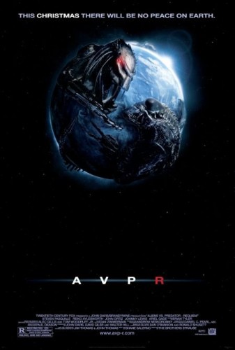
AVPR: Aliens vs Predator – Requiem

I went to see “AVPR: Aliens vs Predator – Requiem“.

I wasn’t ever a big fan of “Alien” movies.  Space horror is not something that turns me on.  However I remember enjoying the “Predator” flicks.  Especially the first one with Arni.  When they mixed the two, it was sort of interesting to see how it will all come out.  And the trailer was excellent.  But the film was somewhat boring, even though it had its momentss.

The Requiem part sucked though.  The good parts aren’t visible because of the constant mix of night, darkness, shadows, absence of lights, smoke, fog, underground catacombs, water, and a bunch of huge objects obstructing the view.  And just to be on the safe side, scenes are cut at every half a second.  That’s about the good parts.

The bad parts are shiny obvious.  The biggest of them is acting.  I know, I know, I’m not supposed to expect any great acting out of a sci-fi space thriller sequel.  But what this movie had doesn’t even qualify for acting.  I have a suspicion that even Keanu Reeves could do better than that (and we saw speculations of that it is possible to replace Keanu Reeves with wooden plank).  I mean, where do they even find actors like this?

Then, there is the Achilles’ heel of all horror movies – common sense.  This film had the smallest fraction of common sense you can see in the horror movie.  People, evacuating from the town in a hurry, are waiting in the traffic jam on the freeway, while the second line is empty.  A soldier popping out his head of the armored military vehicle to see what’s going on with this shooting outside in the middle of ambush. One predator calling another one for help after an accident, and that other predator going into almost full scale war with aliens, without ever calling for any more help.  Alien inserting eggs into women at the hospital for them to give birth to more aliens only a couple of minutes later (previous parts of the movie seemed to have a rather longer period with eggs growing and stuff like that).  The list goes on.  And of course it is possible to find explanations for each one of them, but that will hardly help the feeling of things happening in the way that they aren’t supposed to happen.

As I said, I’m not the big fan of either the genre or these particular movies.  But I think I can realize a good piece of entertainment, when one is offered. And in this particular case, I don’t think it qualifies.  Rating: a weak 4 out of 10.  Feel free to express you disagreement in the comments.