Everybody who ever made a web site, knows that design is hard. Making something outstanding and unique, but at the same time classy and easy to use, requires a professional designer. Everybody who ever made a web site knows that almost all web design is done in Adobe Photoshop, and that after the actual design is done, there comes an often lengthy and painful stage of slicing the design into its web variant – a conversion of Adobe Photoshop .PSD file into HTML, CSS, and web optimized images.
Apparently, slicing up a design is not a tough job it all. It’s slicing it up properly that makes all the difference. Anybody who has Adobe Photoshop installed can slice up a design. Photoshop can do most of the job for you anyway. But it takes a real professional do it properly. Don’t believe me? Let’s see. Have you ever sliced up a design? If so, feel free to answer the following questions in the comments:
- How complex was the design?
- How much time did it take you to slice it?
- In how many browsers did you check the results?
- Did you try to validate the HTML and CSS?
- Did you spent any time making the result load faster – optimize images and code for slow connections?
- How about accessibility – can people with disabilities, people using special software like screen readers, make any sense of the pages that you created?
- Was there any SEO (search engine optimization) – semantic coding – in your work?
- What about the comments in the markup and styles? Did you left any? Will other people be able to modify your results easily?
- Did you have any considerations regarding technical nuances of the job – DIVs vs. tables, fixed width vs. fluid, scalable fonts vs fixed sized ones, etc?
- Did you have to shape your slicing results into a theme for some CMS software, like WordPress or Drupal?
- Have you enjoyed the process? Would you like to do it again?
- How much would you pay not to do it again? Ever again?
If slicing up designs is not your bread and butter, you’ll pretty soon arrive to the conclusion that you need someone else to do it. One of the solutions is to outsource this job to one of the PSD slicing companies. There are quite a few of them out there – some are better, some are worse, some new, some old, and some we know nothing about.
But which company to choose? How to pick the one that will do the magic for you without screwing a thing or two in the process? Well, of course, there is always fear, uncertainty, and doubt involved, but if we are to put these aside, how can we proceed?
Finding a company to outsource PSD slicing was something I’ve been asked to do on more than one occasion over the past few weeks. Finally, I got over my busy schedule and unlimited laziness and came up with something.
There is a web site called MostSliced.com . It is a directory of PSD slicing companies with some brief information about each, user submitted reviews, ratings, and what not. It’s not a huge directory – it only features 20+ companies. It’s not a very user friendly web site. But it’s a good place to start.
Before making any decisions, it’s good to figure out the requirements for the best match. Here are the things I had in mind while learning about these companies – your mileage may vary of course:
- How fast can they do the job?
- How flexible they are in their technical expertise – cross-browser compatibility, W3C standards compliance, SEO, accessibility, code commenting, etc?
- How many people have ever used their services and how many of those got satisfied?
- What were the weak points from those users who weren’t satisfied?
- How expensive are they?
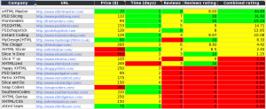
I quickly realized that I need to group MostSliced.com listing into a table, add my own rating, and see which companies are doing the best. So, I fired up my Google Spreadsheet and did exactly that. I’ve published the table for anyone to see, but if for some reason you can’t access it, feel free to use an image below (click it for a larger version).

Things that you see in that table are:
- Company name.
- Company URL.
- Price. This is a price in US Dollars for the first page, as reported by MostSliced.com .
- Time. This is the time in days that the company will need to slice up your design.
- Reviews. This is the number of reviews for this company posted at MostSliced.com for the moment of creating the table.
- Reviews rating. This the average rating of the company given by all reviews at MostSliced.com.
- Combined rating. This is the rating that I came up with. It is calculated like so: combined rating = ((Reviews / 2) * (Reviews rating / 10) / (Price * Time)) * 1000. The idea is the following: half of the ratings are submitted by the companies themselves or by their very biased users. So we’ll just use the other half. We’ll decrease the review rating range from between 0 and 10 to between 0 and 1. Then we’ll multiple this rating by the number of the reviews the company has. The result of this multiplication we’ll divide by a product of time and price. The slower they are, or the more expensive, the lower their rating will be. The more reviews they have, and the more positive their reviews are, the higher their rating goes. And just to make the rating numbers into some sensible numbers, multiply the result by 1,000.
To make things a little bit easier to digest, I added some colors. White and gray backgrounds are just for stripes, to make it easier to read. The best values for each column are highlighted in green. The worst values are highlighted in red. The values in between are highlighted in yellow. The final table is sorted by the Combined Rating, so that the best companies to choose from are at the top. According to these findings, the top three best companies to give our trust to are:
- xHTML Master
- PSD Slicing
- Frontenders
As I said, your mileage may vary. Things that you should keep in mind are:
- There are more companies out there than those that are listed in MostSliced.com .
- There are other factors to take into consideration which weren’t even mentioned here – for example, the timezone the company is in, languages they can communicate with, payment conditions, etc.
- I am pretty bad at anything that needs any calculations. Seriously.
I will most likely continue with the research in this area. Or maybe I will just go ahead and try a few of them out. But in either case, if you have any suggestions or ideas in these matters, please let me know.


