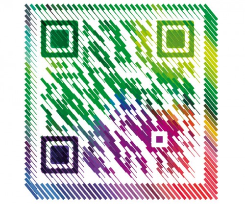
Habrahabr.ru runs an excellent post (in Russian, but with lots of pictures), showcasing some really cool designer QR codes. I’ve tried scanning them with my Android mobile and not all of them worked, but quite a few did. Like this one, for example.
Tag: web design
Responsive typography
I’ve recently made yet another attempt to do so some web design myself. Of course that ended up being a total fiasco, like every single time before that. But as every single time before that, I’ve learned something new. This time, my focus was around typography. The current trend towards a gadzillion web fonts is probably one of the biggest changes in web design that I see. Google Web Fonts alone is a resource one could spend countless hours at.
And just as I’ve wrapped up and threw away my web design attempt, I came across an article on responsive typography. And the very first paragraph of it confirmed what I have realized myself.
With the chaos of different screen sizes and a new generation of web browsers, the design paradigms of layout and typography have shifted away from static layouts and system fonts to dynamic layouts and custom web fonts. Now, screens are changing not just in size, but also in pixel density. In other words: we do not just need responsive layouts, we also need responsive typefaces.
Unlike me though, the authors seems to have a pretty good idea of what they are talking about.
Flickr update : liquid photo page layout
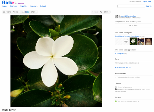
Flickr people once again outdid themselves. An update to the design of the single photo page changes things to the better, much better. Now you’ll the image filling almost entirely your screen, instead of a medium-sized thumbnail surrounded by all the navigational clutter. Here is how it looks now.
And for those of you interested in the technical side of the story, there is a blog post explaining all the different challenges. It might even be interesting for non-technical people to read, just to get an idea of how complex some seemingly simple things can be.
Foursquare’s adorable puppy
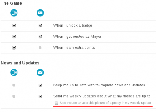
One thing I like about people who love what they do is that they usually don’t take themselves too seriously. They can smile and joke about the things they passionately love. Today I came across an example from Foursquare. In the Settings screen about the notifications that Foursquare sends to you, there is an option to “Also include an adorable picture of a puppy in my weekly update“. Here is a screenshot in case this will disappear with time.
Maintenance screen from BannersBroker.com
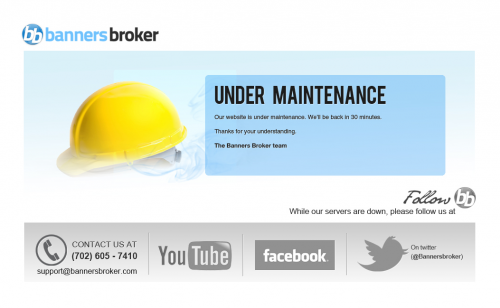
No matter how big or small you are, how much money you’ve invested into your infrastructure, how many levels of redundancy you have, or how many IT gods and gurus you’ve hired to watch over your website – the fact of life is that your website will go down, even if it’s for a brief moment. And you should be ready for that moment. Here is a good example that I came across recently – BannersBroker.com maintenance screen.
It looks simple and and straight-forward. But if you are even remotely familiar with web development and design, you can appreciate how much thinking actually went into this one. First of all, the mere fact that there is a maintenance screen, means that someone thought plenty about the website. Secondly, it’s very well composed. The big yellow helmet and large, bold “Under maintenance” letters both tell you exactly what’s going on. It’s not a user error. It’s not a crashed server. It’s not something to report to the webmaster. They are working on it. Thirdly, it tells you exactly when to come back – in 30 minutes. Fourthly, it still provides you with an emergency contact information – phone number and email. Fifthly, it gives you something to do for thirty minutes that the site is going to be down – explore the company’s YouTube channel, Facebook page, and Twitter stream. Sixthly, it reinforces the company brand. Twice, in full color and full name, and in black-and-white small logo. Seventhly, it doesn’t have any useless junk. What else could you wish for?
To me, this is up there with Twitter fail whale and GitHub 404.


