My lightbulb moment with modular design

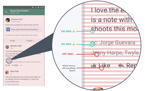
Cameron Lock, of Yammer fame, describes the complexities involved that led her and the team to a simpler, more modular approach to the mobile application design.  The most important bit after grouping everything into modules, practically, I think, is this:

We stopped defining margins between modules. Instead, all the spacing in the app would come from padding within the modules — specifically, top padding. Bottom padding would have worked, too; just not both. The key is to choose one of the two and stick with it.

Modular CSS : Block, Element, Modifier

I don’t do a lot of front-end work these days, but I am genuinely interested in approaches that help build modular systems, especially when the subject is something as messy and as context-dependent as CSS.

Recently, I came across the Block-Element-Modifier approach, aka BEM, which I find interesting.

If you’re not familiar with BEM, it’s a naming methodology that provides a rather strict way to arrange CSS classes into independent components. It stands for Block Element Modifier and a common one looks like this:

.block {}
.block__element {}
.block--modifier {}
.block__element--modifier {}

The principles are simple — a Block represents an object (a person, a login form, a menu), an Element is a component within the block that performs a particular function (a hand, a login button, a menu item) and a Modifier is how we represent the variations of a block or an element (a female person, a condensed login form with hidden labels, a menu modified to look differently in the context of a footer).

This follow-up article provides more details and examples.
Web Developer Tools from Browserling

browserling-effortless-cross-browser-testing

Browserling – an awesome cross-browser testing service, has a collection of Web Developer Tools, which are as simple to use as possible.  There are now more than 80 (!!!) tools, according to this Peteris Krumins blog post, that provide immediate help with things like converting dates and times, formats like CSV, JSON, Markdown, HTML, XML, etc, generating passwords, minimizing or prettifying HTML, CSS, JavaScript, and more.

10k Apart – Inspiring the Web with Just 10k

10k apart

From this article, I’ve learned about an excellent (for our times) 10k Apart competition:

With so much of an emphasis on front-end frameworks and JavaScript runtimes, it’s time to get back to basics—back to optimizing every little byte like your life depends on it and ensuring your site can work, no matter what. The Challenge? Build a compelling web experience that can be delivered in 10kB and works without JavaScript.

Think you’ve got what it takes? You have until September 30th.

I can’t wait to see the submissions and all the ways to squeeze the awesomeness of the modern web into just 10 kilobytes.  This reminds me of the Perl Golf posts over at PerlMonks and Assembly PC 64K Intro from my childhood early days (here are some examples).

SASS Coding Style Guides

Here are a few coding style guides for those of you on the front lines using SASS: