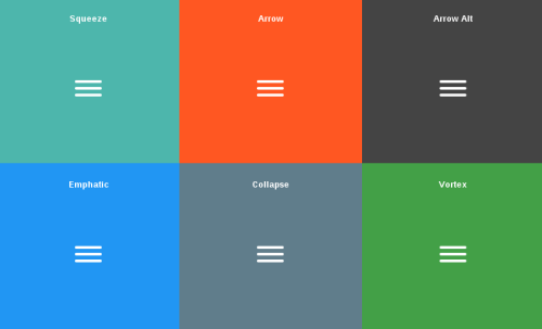
After spending years and years in close proximity to web and user interface design, I’m still amazed sometimes at a variety of ways to solve even the simplest of problems. The growth of the web users on mobile devices has brought us the hamburger icon, which usually hides the collapsed navigation menu. It looks like this:
Now, when you click on that, something happens. The menu expands or collapses, usually. But what you don’t often notice is a tiny bit of animation that is applied to the icon itself. Here is a collection of such animations. There are 14 different effects, both in 2D and 3D. Wow!
