I said it before and I will say it again, Automattic is an amazing company and they do a lot of really cool stuff. Today I received one more confirmation of that – an email with the link to the report of my blogging through the year.
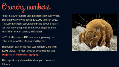
I’ve seen plenty reports, graphs, and analysis. In fact, I have to go through a few pretty much every week. But I don’t remember seeing anything that awesome! First of all, the whole page looks beautiful. It’s an inspiring design with many elements that work nicely with each other. Secondly, there are no boring graphs or dry numbers. A few, carefully selected, metrics create a perspective and make it all sound cool. I don’t know much about other reports yet, but mine said that this blog “had more visits than a small country in Europe”!
On top of that, the report is a technical masterpiece. Probably, not many would notice the uniqueness of the fireworks at the top of the page. But if you just spend a moment, you’ll realize that this fireworks display is unique for every report. It’s a timeline of blog activity. That’s why there is a month and day shown for every fireworks shoot out. (If you are interested in the technical aspects of it, have a look at this GitHub repo).
As I said, the whole thing is pretty awesome, original, and inspirational. I wish more companies were doing this. It would make the world so much better…
