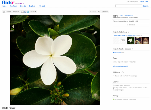
Flickr people once again outdid themselves. An update to the design of the single photo page changes things to the better, much better. Now you’ll the image filling almost entirely your screen, instead of a medium-sized thumbnail surrounded by all the navigational clutter. Here is how it looks now.
And for those of you interested in the technical side of the story, there is a blog post explaining all the different challenges. It might even be interesting for non-technical people to read, just to get an idea of how complex some seemingly simple things can be.

Actually, a picture does not really take all the space it could (see e.g. http://www.flickr.com/photos/m.....943940651/). Their goal is to “display content at a width that will best showcase the most common photo ratio, the 4:3.” I am wondering whether this consistency of width is an aesthetic choice or juts a technology limitation.
As the linked blog post shows, it’s obviously a choice, not a technical limitation. I think Flickr has plenty of resources to overcome technical limitations in image display. :)