Visualization of the European refugee crisis

refugees

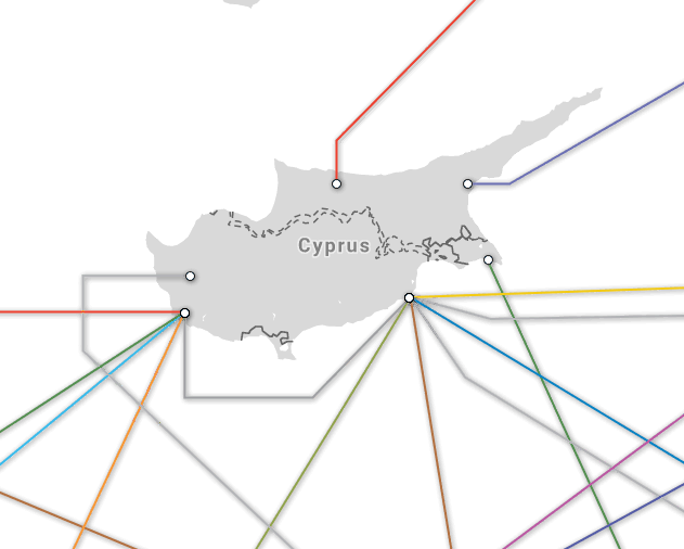
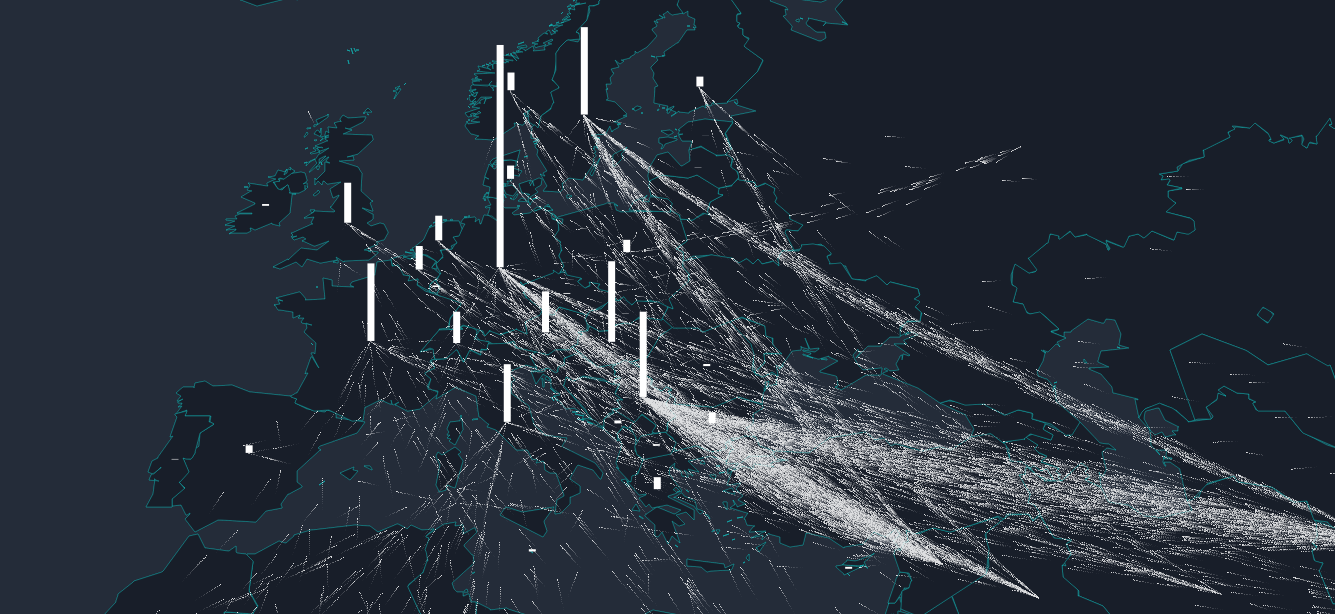
The flow towards Europe project provides a vivid visualization of the refugee migration.  It is an interactive map with breakdowns by country, and with a timeline covering the years 2012-2015.

Europe is experiencing the biggest refugee crisis since World War II. Based on data from the United Nations, we clarify the scale of the crisis.

The Box That Built the Modern World

Slashdot runs the story on the shipping container and how it changed the world:

Think of the shipping container as the Internet of things

Make sure to read the discussion as well, as there are quite a few insightful and interesting comments, with calculations, comparisons, and such.

Waze : Global Driver Satisfaction Index

driver satisfaction rating

Waze, the social networking for drivers, presents some analysis of global driver satisfaction.  It’s not covering 100% of the globe, but it’s still interesting to look into differences between countries and cities.  See if you can find anything surprising…