I’ve been a happy owner of Motorola Defy for more than a year now. It is a fantastic phone – small, well built, water resistant and powerful enough. The only thing that bothered me about it was that Motorola stopped releasing Android updates for it and it was stack at pathetic 2.2 when the rest of the world was enjoying Android 4.0.
There was a way, of course. People have been hacking phones for as long as … well, forever. And there is a well established path of rooting Motorola Defy and upgrading it to the newest version of Android. I’m not the hacking type (when it comes to phones at least), so I was delaying the upgrade for as long as possible. But with the recent hype about Galaxy Nexus phone and how awesome Android 4 is, I couldn’t any longer.
I didn’t read much of the instructions, and I didn’t quite got how the process works. Heck, I didn’t even verify the versions of all the firmware and kernel and apps that I’ve downloaded to install. So obviously my attempt failed miserably. I bricked the phone. At first, it was responding to recovery boot option only, but there was nothing useful in there, so I formatted everything and pushed the original firmware. Which was for a different phone or country or something else. After that, the phone didn’t even respond to the power button anymore. Dead.
I gave it to a friend, who is more experienced with these things, to see if he can revive it. But in the meantime, I couldn’t stay without the phone, so I rushed to the shop and bought myself a … Galaxy Nexus.

The price for this phone varies from place to place. If I had more time, I could have gotten it for about 350 EUR. But since I was in a hurry, I was robbed off 600 EUR. Yeah, that’s the way it works. But I wanted it so much for so long that I didn’t really care. I’ll care next time, I promise.
Before I go into any detail, let me just say this – Galaxy Nexus is everything I wanted from an Android phone and even more. Now that I have it for almost two weeks, I can say that the positive feeling I had about it on the first day still lasts, and the more I have it, the more I can do with it and the more I like it. Now, for the details.
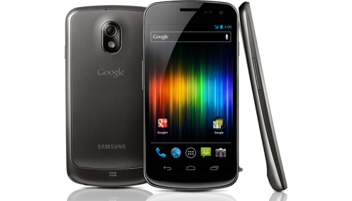
First things first. This phone actually has a Google logo on the back of it. For a long time Google fan like myself, that by itself is worth the phone price. It’s especially cool having that logo on the device that is so tightly integrated with all the awesomeness of Google services – Gmail, Google Calendar, Google Search, YouTube, Google Picasa, Google+, Google Maps, and so on.
Secondly, the thing that stands out immediately after unboxing the phone, it’s its form factor. Compared to Motorola Defy, it’s huge! It’s was almost awkward holding it, so big it was. But, for that size, it was surprisingly thin and light. I guess it’s made of plastic not glass and metal. After using it for a day or two I totally got used to its size and it wasn’t awkward anymore.
Thirdly, the screen. The moment the phone is turned on, you know that you gonna love it. There is no way not to love it with that screen. As mentioned before – it’s huge. 4.65 inch diagonal, 1280×720 pixel resolution, and the brightest and vividest colors that I’ve ever seen on a mobile device or tablet – an absolute pleasure.
Fourthly, the performance. It’s super fast. It’s super fast compared to Motorola Defy. It’s super fast compared to my laptop. It’s just super fast. It’s so fast that it needs some getting used to. Every single phone I ever owned, was slow compared to this. Browsing through address book, making phone calls, editing the calendar, checking email, surfing the web – all of it is flying.
Fifthly, the software. I’ve been introduced to the variety of the software for Android for some time now. But the tricky bit with Android Market is that it limits the apps based on the features your phone supports. For example, if you are browsing the market with a device which runs Android 2.2, you won’t see any apps that require Android 2.3 or Android 4. Same with some other features – large screen, WiFi connection, etc. But with Nexus Galaxy you will pretty much see everything! It looks like that it supports and runs every single app in the market. And there are really awesome apps.
Now that I’ve praised and boasted about Galaxy Nexus, you probably want to know the downsides. Are there any? Yes. Everything has a downside. Galaxy Nexus has two – one easily solvable, one not.
The easy one is the USB. The one of the biggest differences between Galaxy Nexus and other devices is that it does not support an external SD card. Internally, therefor, it keeps the operating system, applications and all files on the same media. Which is dangerous to give access to non-technical people. Things can get deleted or overwritten via USB. So it doesn’t support USB mass storage protocol. Instead, you need to access it via MTP, which requires additional software or drivers. Which I didn’t want to bother with for my Fedora Linux. The easier way is to install AirDroid application on the phone. When you install and start it, your phone will provide a desktop-like web interface to all the features, using a WiFi connection. With that, you can do pretty much everything – upload and download files, reorganize folders, browse through contacts, and even send SMS.
The other issue is with volume and power buttons. They are on the same level, on opposite sides of the device, which makes it nearly impossible pressing just one of them using one hand. The index finger presses on the volume button at the same time as the thumb on the power button. Somehow, I keep switching the screen off every time I need to adjust the volume, and volume up every time I wanted to send it to sleep. Not a biggy though.
So, would I recommend Galaxy Nexus? Absolutely! It is the best mobile device I’ve had my hands on. It works well both as a phone and a small tablet – for games, web browsing, and reading. It is super fast. It lasts more than a day on the battery, even with heavy usage. It’s not that expensive, if you are not in a hurry. And it has a Google logo on its back. It is brilliant.
P.S.: the friend to who I gave my bricked Motorola Defy managed to revive it. And not only – he upgraded the Defy to Android 4.0 as well. Now that I have my Galaxy Nexus, I’m not going back to Defy, but my wife will get a much needed phone upgrade for her 7-year old Samsung. So all is well.


