Xfce4 saves the day

After almost a full day of tweaking configurations and swearing at both Gnome3 and KDE4, I decided to follow my brother’s advice – try Xfce4.  This is yet another desktop environment available in Fedora 15.  I’ve heard a few good words about it, but never actually tried it out.  Today was the day.

The first look around after a quick installation showed that most of the things I’ve been fighting with in Gnome3 and KDE4 just work.  Xfce4 uses a lot of configuration from those other desktop environments, but somehow it actually understands what the user wanted to configure, even when neither Gnome or KDE do.

Xfce4 has a very simplistic tough to it.  It feels at firs that something is missing.  And maybe something is in fact missing.  But after working with it for a couple of hours, I still didn’t realize what it is.  Maybe it’s not as polished or as wow-ified as other desktop environments.  But it works!

All I needed and wanted for my daily routine is there – desktop icons, panels with application shortcuts and widgets, keyboard switcher with flag icons, useful workspace switcher with application thumbnails and windows drag-n-drop support.

Even more surprising was the fact that Xfce4 picked up my font preferences.  Gnome3 was configured with nice fonts.  KDE4 was configured with nice, but other fonts.  And they didn’t want to recognize each other’s font configurations.  Xfce4 got with no effort on my part!

After losing almost a full day to configuration and tweaking I finally have a desktop environment which I can actually use. Hooray!

Fedora 15 : Gnome3, here we go again

As you probably know, Fedora 15 was released yesterday.  I’ve been waiting for this release with a big worry in my heart.  While I did, of course, want to have a look at the new service manager systemd and enjoy the power management improvements, I had my doubts about Gnome3.   My doubts were based on two reasons.

Firstly, for the last decade or so, every major release of Gnome or KDE disrupts my workflow so much that I have no other option but to switch to an alternative desktop manager.  When the new KDE comes out, I switch to Gnome and when the new Gnome comes out I’m going back to KDE.  Not because I want to, but because there is a limit to how much I can take.

Secondly, because I’ve heard so much praise about Gnome3 and the new Gnome Shell, that I actually tried it out when it was in early beta.  I was puzzled then and I hoped that something would be done about the migration process.

Don’t get me wrong, I like new software, new ideas, and new designs.  But I also need to work.  My daily routine doesn’t require much desktop usage – I spend most of my time in the browser and in the text editor – but I do rely on things to work.  In particular, I need my shortcuts to work, I need my desktop icons to be where I left them, I need application shortcuts and system monitoring widgets.

Back when KDE4 was released, they decided to get rid of desktop icons.  There was a way to add a folder view to the desktop and sort of have the same functionality, but it was too different for my tastes.  Now, Gnome3 goes south too.  After the upgrade to Fedora 15, Gnome3 kicks in, and all the icons from the desktop are gone.  They are still in your Desktop folder, but they are not displayed on the desktop anymore.  And I can’t seem to find a way to add them back.  Also, all widgets and application shortcuts are gone from the panels.  Yes, you can now switch and search and find applications, but it’s way longer than just clicking on an application shortcut in the top or bottom panel.  As to the CPU, network, and other system monitoring gadgets, I can’t see away to add them back.  And that brings me to the next point…

Migration path.  It is a common practice in software design to guide the user through the interface when the user sees the interface for the first time.  Especially when the user is used to seeing a totally different interface previously.  A couple of arrows showing where things are would help a lot.  A quick tour guide would be ideal.  But none of that appeared in my fresh Gnome3 desktop.  I somewhat figured out how to move around.  But I am far away from being productive with this new interface.  And even to get to where I am – I had to spend a couple of hours, given that I am also a technical person with some understanding of how desktops work and what they do.  A though of upgrading my wife’s and my son’s computers sends shivers down my spine.  It will be a disaster.  I’m not comfortable with not upgrading them also, but I guess they’ll have to stay on Fedora 14 for now.

There is something else that bugs me quite a bit about these new changes.  They seem to be fixing stuff which is not broken.  I mean pretty much every desktop user out there is familiar with the desktop workspace, icons, shortcuts and main menu.  Why change that?  It does work!  Are there things that don’t work?  Well, since the beginning of times, people were complaining that you can’t change Gnome calendar display to show Monday as the start of the week (yeah, there is a way, which involves locale compilation and system-wide changes), and flag icons on the keyboard layout switch (there was a workaround for the older version of Gnome which I applied, but now the icons are gone again).

I do appreciate all the hard work all those brilliant people put into this new Fedora 15 and Gnome3 releases.  Thank you all.  I know, you worked hard.   But the result is a devastating user experience, as it is now.  And it doesn’t have to be.  It’s like 99% of the work was done and only a tiny bit is missing.  But without that one bit, the other 99% don’t make any sense.  This is a great pity.

With that, I’ll spend another couple of hours trying to figure this Gnome3 thing out and if it won’t start working for me by some magic coincidence, I’ll have to switch to KDE.  Again.

P.S.: As for the rest of the Fedora 15 release, it looks alright.  I did lost my wireless connectivity on my home laptop, but that is probably because kmod-wl-something is not available for the new kernel or yum didn’t pick it up.  I’ll stick a cable in it later today and will try to update.  Hopefully it will work out.

P.P.S. : My brother pointed out to me that some of my problems can be fixed by installing gnome-tweak-tool and tweaking the configuration. At least I got my Desktop icons on the desktop now.
Adding flags to Gnome keyboard layout switch

One of the little things that has been bugging me for a few years now is the Gnome keyboard layout switch.  I am using two layouts – English and Russian – and instead of having two nice flags, like in KDE, I had to live with ‘USA’ and ‘RUS’ letters in my task bar.  Not that big of a problem, but annoying.  Icons are much easier and faster to understand than text.  And all the other things in my task bar are graphical, so the text stands out too much.

Today I finally decided to do something about.  Thanks to this forum post I had a solution in hand which almost worked.  The steps were:

  1. Download en.png and ru.png icons into ~/.icons/flags/ folder.
  2. Run gconf-editor.
  3. Change the value of /desktop/gnome/peripherals/keyboard/indicator/showFlags to true.

The only thing that went wrong for me were the actual images.  Gnome scaled them to 24×24 pixels and they looked rater ugly.  So I created my own icons using Gimp.  I created a new image 24×24 pixels with transparent background and then dropped in the center of it the flag icon that I got from the FamFamFam icon set.  Saved the results back into the ~/.icons/flags/ folder and vuala!

Delete files dialogue in KDE = ugly

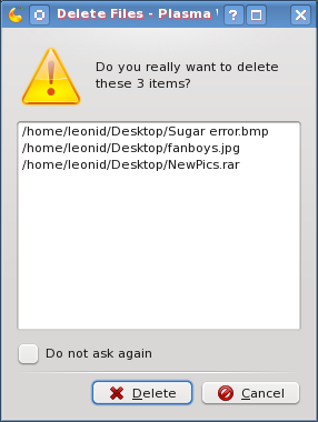
As I am getting used to KDE 4 more and more, I am enjoying it more and more.  It delivers plenty of visual pleasure while being quite fast and user friendly.  However, there this one tiny little thing which annoyed the heck out of me since ancient times.   It’s the delete files confirmation dialogue.  Every time I select one or more files to delete, here is what I get.

KDE delete files dialogue

The more files I have to delete and the longer their paths, the uglier it looks.  And you know what annoys me the most?  It’s that fixing this ugliness is pretty simple.  Just collapse and hide the list of files which are about to be deleted, and give a “Details…” button or link to expand the list for those who really care or want to double check.  This way, the popup will be much smaller, providing enough of necessary information (“delete” vs. “move to Trash”, and “3 items” vs. “all these items”).

I don’t know how this managed to stay in for so long.  Am I the only one who cares about this?  Or are there so few KDE developers that nobody has the time to fix this?  Do I really need to this myself?  I hope not …

Another look at KDE 4

Last time I wrote about KDE 4, I said that it wasn’t very usable for me.  Recenlty, the much praised upgrade to KDE 4.2 became available via Fedora updates.  So I got it and switched to KDE for a couple of days.

What can I say?  Quite an improvement indeed.  Mostly stable, with only a few issues, which are nicely balanced out by nice desktop effects, overall graphics, and plasmoids.  A few things moved around and I had to look for them (such as keyboard shortcuts for switching between desktops), but overall it was a pleasant experience.

Why am I back to Gnome for now?  Because of the following:

  • couldn’t manage to make KDE 4.2 work properly with two monitors (major issue)
  • got a bit annoyed by KDE 4.2 not waking up properly from suspend  (not always, but often enough)
  • also got annoyed by it not always coming back properly from screensaver mode
  • couldn’t find graphical configuration for power managment (my laptop kept suspending when idle for 5 minutes with no power plugged in)
  • a few other minor things here and there

I’m sure I’ll be back to KDE very soon.  The progress between KDE 4 and KDE 4.2 is huge and if it goes like this, then I won’t have to wait long.