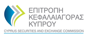
A while back I blogged about Cyprus Securities and Exchange Commission website using a copy-paste design of the logo from the United States Department of Health and Human Services. Since then, CySEC website got a new look and feel, as well as a new logo. Well, it looks like they haven’t really solved the problem of the copy-paste. Have a look yourself. Here’s the updated CySEC logo from their current website:
And here is the logo from the Money Project:
Arguably, not exactly a copy-paste like before, but way too similar not to fall into the plagiarism, which is just a fancy word for the copy-paste.

