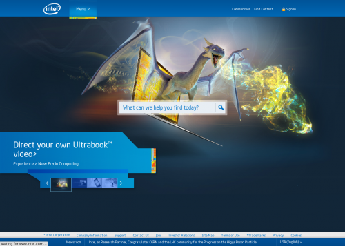
Today someone mentioned on Facebook that Intel.com website is very well organized and is quite useful. Being a fan of useful things, I immediately went to check it out. And I have to say that I am mighty impressed! Not only it is very organized, providing quick access to information, but it looks really good as well. Such a combination is rare these days, but it is particularly rare for a large corporation’s website.

Zakhar Kirpichenko liked this on Facebook.
Sergey Popov liked this on Facebook.