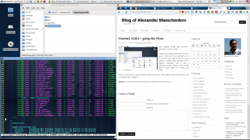
After almost a full day of tweaking configurations and swearing at both Gnome3 and KDE4, I decided to follow my brother’s advice – try Xfce4. This is yet another desktop environment available in Fedora 15. I’ve heard a few good words about it, but never actually tried it out. Today was the day.
The first look around after a quick installation showed that most of the things I’ve been fighting with in Gnome3 and KDE4 just work. Xfce4 uses a lot of configuration from those other desktop environments, but somehow it actually understands what the user wanted to configure, even when neither Gnome or KDE do.
Xfce4 has a very simplistic tough to it. It feels at firs that something is missing. And maybe something is in fact missing. But after working with it for a couple of hours, I still didn’t realize what it is. Maybe it’s not as polished or as wow-ified as other desktop environments. But it works!
All I needed and wanted for my daily routine is there – desktop icons, panels with application shortcuts and widgets, keyboard switcher with flag icons, useful workspace switcher with application thumbnails and windows drag-n-drop support.
Even more surprising was the fact that Xfce4 picked up my font preferences. Gnome3 was configured with nice fonts. KDE4 was configured with nice, but other fonts. And they didn’t want to recognize each other’s font configurations. Xfce4 got with no effort on my part!
After losing almost a full day to configuration and tweaking I finally have a desktop environment which I can actually use. Hooray!

I don’t know what problems do you have with KDE 4 :) I use it for a while and it works perfect. Even after upgrade to Fedora 15.
One of the most annoying problems is fonts. In particular, the misalignment between fonts in Qt-based and GTK-based applications. Skype for example, looks fine when I start it under Gnome, but when I use it in KDE it has horrible fonts – English is 3 times larger than Russian, line spacing is screwed, etc. I tried to correct the problem, but failed.
Another problem I have with KDE is its workspace pager. It’s unusable for me, because I use thin panels and I still want to see application icons and to be able to drag them from workspace to workspace.
Main menu is also not my favorite. I understand it might be better for novice users who don’t know where things are (search) and who are familiar with Windows (similar menu) but I just want the old fashioned one.
Things like that. They might be tiny details who nobody pays attention to, but for they are actually show-stoppers, killing my productivity.
I’m glad though that your desktop works fine after the upgrade. After all the time I’ve spent in the last three days tuning these things, I can appreciate how it is when things just work. :)