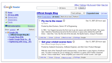
Google updated the design and interface of the RSS feed aggregator – Google Reader. Here is a really small screenshot of how it used to look (stolen shamelessly from Google Reader front page – it seems like they forgot to update it):

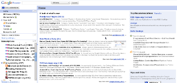
And here is a really small screenshot of how it looks now (I made this one, you can make your own):

In my opinion, the old interface was much better. Colors and borders helped to visually separate the sidebar from the main content area, as well as news items from each other. The new design is much “separated”. Also, there are a few minor quirks and bugs here and there, which will hopefully get fixed in the next few days. However, one thing is great about this new release – speed. The new Google Reader is much faster than the old one. Extra responsiveness can’t hurt, especialy thos of us who go through hundreds and thousands of posts in a fast paced manner.
I disagree. Previous Interface was overloaded by some extra staff, and was not flexible. What was the point to have those round corners on the frames? What was the point to highlight the background of a side bar by blue? Why two parts of navigation were separated by “add subscription” button? Generally, old face was overloaded. It was not aimed to be maximum useful, but to represent all the features of reader directly on the page, but not to be hidden above drop-down menus. This interface was self-advertising and was aimed to attract more users.
New interface, in other hand, does not offer a thousand of options. It just offers you to add, to navigate and to read. The rest settings are optional. KISS
Well, “useful” is one, “visually pleasant” is another. I think that the old interface was a nice compromise between the two. The new one might be much simpler, but it doesn’t have the aesthetics of the old one – that’s for sure.
I like new interface more then old one. It looks better and lighter.
You are right in the point. Previous design was a compromise between two. What is compromise? Compromise is then there are some common factors unified. If you aware of mathematics, it is intersection of sets of property’s of both design aims. So it means none of aims are really reached. Current design is aimed to simplicity and it is simple. No compromises. So in my point of view previous one didn’t have aesthetics at all. So do new one. This term is not suitable.
OK. Let me put it simpler then. I am spending a few hours a day in Google Reader. Before I enjoyed it. Now I don’t. However now it is faster, so I spend a bit less time. But I’d rather enjoy it too :)
I am not trying to argue with you – just mentioning my point of view about usability.
Aren’t you too conservative?
Probably I am :)