Google Reader updated interface

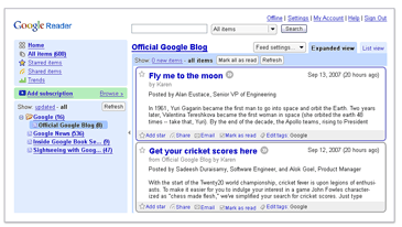
Google updated the design and interface of the RSS feed aggregator – Google Reader.  Here is a really small screenshot of how it used to look (stolen shamelessly from Google Reader front page – it seems like they forgot to update it):

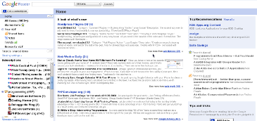
And here is a really small screenshot of how it looks now (I made this one, you can make your own):

In my opinion, the old interface was much better. Colors and borders helped to visually separate the sidebar from the main content area, as well as news items from each other.  The new design is much “separated”.  Also, there are a few minor quirks and bugs here and there, which will hopefully get fixed in the next few days.  However, one thing is great about this new release – speed.  The new Google Reader is much faster than the old one.  Extra responsiveness can’t hurt, especialy thos of us who go through hundreds and thousands of posts in a fast paced manner.

Google Reader recommends

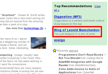
Imagine my surprise when I looked at “Top Recommendations” area of my Google Reader today and found … my own blog over there.

Yes, I know that these recommendations are based on the feeds that I read.  But still!  Is it the time to celebrate the recommendations technology, which recommended me to me over a gadzillion of other blogs?  Or maybe this is a day of Ultimate Technological Silliness, when Google, a search company that forgets nothing, somehow arrived to the conclusion that I might not be reading my own blog?  These questions remind me of a “half-empty or half-full glass of water“.  I guess a lot depends on the personal perspective…

Hope to see more language controls in Google Reader

If you read this blog even for a short while, you probably know that I depend on many Google tools, such Gmail and Google Reader. As a power user, I believe I know pretty much everything these services have to offer. I also know a few things that these services don’t have on offer yet, but which I’d gladly welcomed.

I already mentioned a sharing of interesting items in Google Reader with your contacts. That’s a really nice feature. And you can even control which users you see shared items from. However, one important thing is missing in that functionality – language control.

You see, I don’t have that many friends who are using Google Reader and share items, but even those few that I have speak a total of 7 languages (Russian, English, Greek, French, Ukrainian, Dutch, and German). Not only they speak this languages, but they also share a lot of items in those languages. That is sort of useless, since I only know two languages – Russian and English. These two are enough to provide the common ground for communications with all of my friends.

So, what I would really like to see in Google Reader, is a new setting which would let me filter my friends’ shared items to only those languages that I can understand. I know this can be a bit tricky to implement (how does the system know in which language the shared item is? or, even, what should it do if shared item is in more than one language?), but it would be really helpful functionality. And a huge time saver too, since then I wouldn’t have to go through all those items that I have no understanding off and marking them as read.

Should such a feature appear, I’d like to see it taken to extreme. I should be able to automatically tag or do searches on content in specific language. This will give me a useful tool of comparing hype about the same topic in different language communities.
Google Reader search within single feed

I’ve been using Google Reader for quite some time now, but it was only today that I noticed that I can search within a single feed.  The drop down menu near the search box at the top contains choices like “All items”, “Starred items”, and “Shared items”, which are followed by the tags.  But if you scroll further down, after the tags, there is a list of all your subscriptions.  You can pick any feed that you are subscribed to and search within it.

I’m not sure if this is a recently added feature or if it was there for ever, but it’s priceless.  I was missing out on it, because I use way too many tags and, apparently,  never scrolled down deep enough.

Google Profile coming up

In my recent post about Google Reader and Google Talk integration I mentioned that it would be nice to have a possibility to control friends’ names and pictures.  Similar to the way I can do so in Gmail.  Having things a bit more centralized would be nice.

Obviously, Google realizes that.  They are some of the smartest people put together after all. Well, it looks like we’ll have something centralized in the near future.  Web Worker Daily runs a post about Google Profile.  Good news.

And while I was going through that stuff, I had a thought (yes, again).  Google must have some really nice tools for its developers. Usually, companies try to maximize the utilization of available resources, boost code reuse, and minimize time spent on re-implementing things.  Google shown a few decentralized bits over time.  Like this contact management issue, for example.  That probably means that creating something like Google Profile (simple, but very scalable application) has been made extremely easy.  It’s like it is easy to make one rather than to decide if one is really needed and what are the alternatives and how to use those alternatives. That, or they have some a weak approach to code reuse – something that I find hard to believe.  Either way, it’s interesting…