- New note : Conversion Pros – SEO / Marketing / Web services http://bit.ly/kWdzcN #
- Shared: Fixing Cyprus one municipality at a time http://bit.ly/kX9ZR3 #
- Office fun: on the left my first prototype ring. On the right – the pro version. :-) http://t.co/eytB04o #
- I'm at Hellenic Bank (Arch. Makarios Ave, at Grivas Dighenis Ave, Limassol) http://4sq.com/igP6c3 #
- I'm at Rio Bravo Saloon (5 Ariadnis St, Mouttagiaka, Limassol) http://4sq.com/lLU3hT #
Author: Leonid Mamchenkov
Day in brief
- I'm at Logos School of English Education (33-35 Yialousa St, Limassol) http://4sq.com/mC5D8I #
- I'm at Starbucks http://4sq.com/iWnbYs #
Branches graph at GitHub
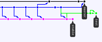
One of my favorite features of GitHub (and, probably, pretty much any other git client) is the graphical representation of branches. It usually gives a crystal clear picture of how the source tree came about to be. But I think today I actually managed to confuse the heck out of it. Have a look at the screenshot below.

A couple of commits ago it was a master branch (black) and a stable branch (magenta). Then I (if I remember correctly) created a test branch from the latest stable, pushed it, switched to stable branch, reverted one commit, and pushed it as well, then added a couple of commits to master and merged it into test. Pushed and got the thing above. Weird looking source tree mutant.
Anyway, I’m sure it will sort itself out some time later.
P.S.: Indeed, as expected, after just a few more merges, commits, and pushes the tree sorted itself out. Lovely GitHub, very lovely!
Day in brief
- Apparently, I got really drunk on April 17 and upgraded my hosting server to Centos 5.6. I have no recollection of that. #
- Inbox Zero! Not a single message in my inbox right now, read or otherwise. #
- New note : Install 1GHz Overclocked Rooted Android 2.2 FroYo On Motorola Defy http://bit.ly/iAaVhQ #
- Just pushed new version of the project to the live server: 765 files changed, 74540 insertions(+), 2712 deletions(-). Now that's a release! #
Day in brief
- Shared: Osama Bin Laden Reported Dead, Body In US Hands http://bit.ly/le8bMG #
- I don't see it. Do you? Motorola DEFY Receives Android 2.2 Froyo Update – Softpedia http://bit.ly/kA5E3n #