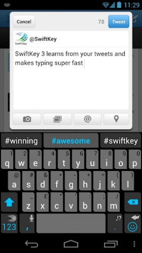
Following the recommendation of my brother, I’ve installed the SwiftKey3 keyboard on my Google Nexus. And I have to say that it’s worth every cent of its 0.85 EUR price tag (there is a special offer currently too). I’ve tried a few keyboards until now and, I’ll be honest, I was skeptical of its prediction powers. After all, each person’s language use is different, and I mostly use English when I write, and it’s not even my native language.
 But all my worries and skepticism were for nothing. It does work and it works wonders. The secret, of course, is that SwiftKey 3 learns your language from Facebook, Twitter, Gmail, SMS, and blog’s RSS feed. I first added Facebook and Twitter and didn’t see much of an improvement. But after it learned from my SMS messages and Gmail, it got much better. The moment I gave it this blog’s RSS feed, it became nearly perfect in predicting what I was about to say. So much so that it would suggest the next word I wanted to type before I would even type a single character. Like with visual arts, I can’t really find the words to describe how awesome that feels.
I am still getting used to it being so good – after all the other keyboards’ predictions it takes a bit of time. But even so it already saves me plenty of typing. Which is a good thing always, but on the mobile device – doubly so.
And before you ask, yes, there is something that I wish it did better. I wish it had a better layout for the Russian language keyboard. While it’s usable, the keys are smaller and harder to hit. However, it still compensates the inconvenience with a better Russian text prediction too.
Much recommended!