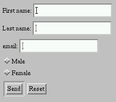
There is an interesting article by Simon Willison at SitePoint.com. The article is about few simple tricks that can improve the usability of web forms. Things like automatic focusing on the text field the second the page loads in; and using CSS and labels to help users to navigate and feel-in the forms easier.