I predict a huge spike of comparisons and boasting in the blogosphere in the next few days. The reason for such prediction is Google Reader’s newest feature – charts, trends, and stats.
The graphs and tables provide way more information that I could ask for. And all that fits nicely on a single page and is rather intuitive. How is that possible? What’s there? You have to check it for yourself, of course. But I’ll give you a brief description, just in case you don’t use Google Reader.
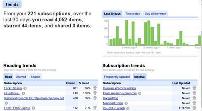
There is a brief summary, which says something like:
From your 221 subscriptions, over the last 30 days you read 4,052 items, starred 44 items, and shared 0 items.
I’ve spent a lot of time during the last two days, throwing out feeds that I don’t read. If only I knew…
Then, there is a little graph which has three tabs. The first tab shows the daily items read for the last 30 days. My highest spikes go to about 400 items per day. The second tab shows my reading activity during the hours of the day. For me, it appears, the busiest reading hours are in the early morning, around 3:00-4:00 am, at noon, and in the evening, around 07:00pm. The third tab shows my reading activity over days of week. Thursday seems to be my favourite reading day, with other weekdays following closely. Interestingly, on Saturdays I read twice as little as I do on Sundays.
Below are two tables. Left table displays my reading trends, and has three tabs. Right table shows subscriptions trends and has two tabs.
Reading trends table shows a few subscriptions with the number of posts read and the respective percentage of posts read against the total number of items in the subscription. Other two tabs show numbers for Starred and Shared items. I Star selected items, and never mark anything as Shared, because I use tag sharing features.
Subscription trends table has two tabs – one for Frequently Updated subscriptions, and another for Inactive subscription. Frequently Updated tab shows the number of new items per day, and percentage of read items. The Inactive tab shows the date of last update for each subscription.
And here is the best feature ever about this table – there is an Unsubscribe icon for each subscription. That means that it will take me about 10 second to identify very “noisy” subscriptions and very “silent” subscriptions and get rid off them. Thank you Google so much for this!
For each of this tables, there is a tiny control at the bottom of the table, that allows to switch between top 10, top 20, and top 40 items to display. Very nice touch as well.
Below those tables, there is a tag cloud. Tags are set in different font sizes and shades of grey – from very light to black. The help line nearby says: “The more items a tag has, the bigger it appears. The more of those items you have read, the darker it is.”
And I think that’s it…
Really, really great stuff! You should check it out.